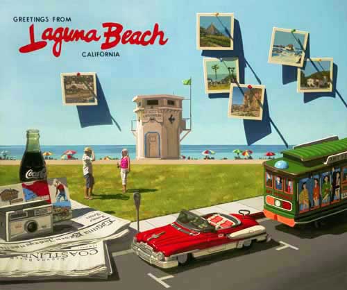
 Here is my prop
setup for my next painting, "Greetings
From Laguna". The painting
will tell a story of a young couple who has
traveled by car to Laguna, taking a number of
photos to document their stay.

The
photographs are from a 1963 Kodak Instamatic 100
(sitting on the two newspapers), noted for their
square format film. I've 'push pinned' them to
the wall which will be my sky in the painting.

The
couple arrived in Laguna in style, with their two
toned convertible.

I'm using
some old lettering off of a vintage postcard for
the wording across the sky.

Here I am
working on one of the photographs. Notice the
rough layout (created in Photoshop) that I have
taped to the canvas.

I took
advantage of certain colors when I mixed them,
applying the sky blue on all the photos that had
a sky. I also painted the cast shadows, starting
to give some dimension to the painting.

Here is a
snapshot of the gazebo in Heisler Park.

The Hotel
Laguna.

Bird
Rock.

The City
Hall/Firehouse.

Lawnbowlers
in Heisler.

The
Victoria Beach Tower.

Here is
the grouping of the five photos, each pinned to
the sky with a color push pin.

Here's a
look at the entire canvas.

The Coke
bottle is next. I've photographed it with a
painted background, giving me a better idea of
what the boardwalk and ocean look like through
the glass.

Here's
the bottle, sketched with its first coat of
paint.

I've just
added the preliminary washes for the Pottery
Shack postcard, probably one of the most popular
Laguna Beach postcards of its time. Notice The
Laguna Greeter, Eiler Larsen in the upper right
corner of the card. This is the statue of Larsen
which still graces the corner of Brooks Street
and Pacific Coast Highway, the original location
of the Pottery Shack.

I've
begun to paint in some of the lettering on the
two local newspapers, the Laguna Beach
Independent and the Laguna Beach Coastline. Since
the lettering influences the reflection on the
face of the camera, I've indicated it first.

The Kodak
Instamatic 100 used the 126 film (Kodapak)
cartridge. The image was 26x26mm giving the name
126 to the film. I've roughed in most of the
black detail...

...and
now the gray of the reflective metallic front.

With the
camera done, the two newspapers could be
finished, using shades of warm grays to show the
curves of the paper surfaces. Their cast shadows
are also defined.

Here's a
photo of the entire grouping which, besides
helping to tell the story, it serves as a design
element on the left of the canvas, steering the
viewer's eyes back to the focal point of the
painting.

This
photo is of the entire bottom of the canvas where
I've just scrubbed in the street color.

The
convertible is next. I keep my eye out for cool
looking tin cars for use in my paintings. This
one is by far one of the coolest. It still had
the plastic windshield in place. The reds are
defined first, along with the fine black detail
lines.

Notice
that I've added a wind up key on the trunk of the
car. I want my audience to quickly realize that
this is a toy. Using toys instead of the real
thing allows me to have fun with my story telling
and gives the viewer another element to reflect
on.

Here are
my models for the painting, Mr. and Mrs. Steven
Beaupré (my daughter Hayley and her husband).
They are posing out in the street in front of our
house, just as Hayley has since she was a little
girl... aaahhh, the time flies.

The clear
blue sky is now blocked in, using a mixture of
Thalo Blue, Cadmium Yellow and Permalba White.
This medium light value defines the white borders
of the photos.

Here's a
closer look.

With the
same color mixture, but darker, I've rendered in
the ocean, defining the beach umbrellas and sun
worshipers.

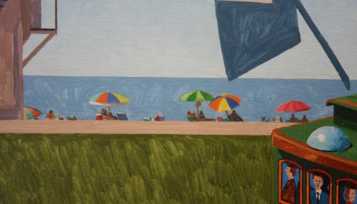
Here's
the whole canvas.

A closer
look at the lawn area...

...and
the entire canvas.

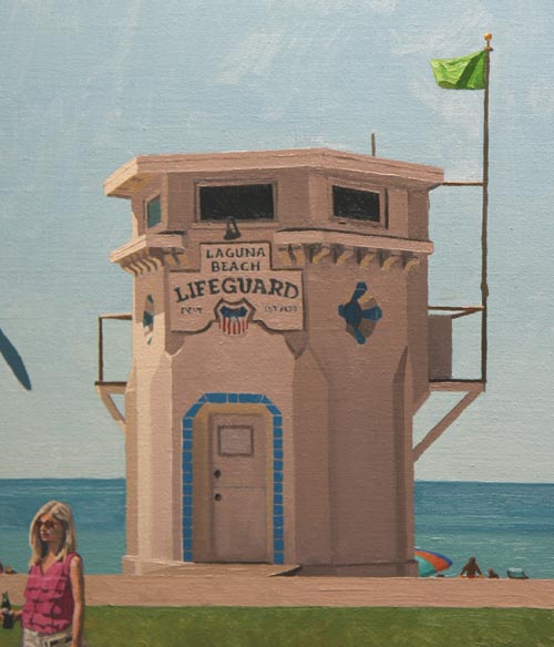
The
Laguna Beach Lifeguard Tower is one of Laguna
Beach's historical icons. Originally part of a
gas station built in 1926, the tower was moved to
Main Beach in the 1930's. Although it has gone
through a couple of major renovations, its
architectural integrity has been maintained and
it is probably the most photographed and painted
structure on the Southern California coast. It
will serve as the backdrop for my couple's photo
session at Main Beach.

Next is
the Laguna Beach Trolley. No one has made a toy
of the Laguna Beach Trolley, so I used a vintage
tin trolley from San Francisco. With the Art
Festivals signage, I made it Laguna. I love the
old graphics on tin toys. Notice that this
trolley is full of real gentlemen, as they are
all standing and the ladies occupy the seats.

This
detail shows the beach umbrellas and beachgoers
on the left side of the painting...

...and
here's the right side.

Hayley is
holding a bottle of Coke in her right hand and
clutching both of the local newspapers in her
left. Her blouse (alizaron crimson + cadmium red)
and pants are beginning to be rendered along with
some details defining her profile and neck.

With a
few delicate strokes with a 00 sable bright
brush, I've put in the flesh tones. The
sunglasses gain their transparent look with the
proper placement of small slightly contrasting
values.

Look
closely and you can see the grass reflecting into
the shaded area on the back of her pants.

Steve's
shirt is getting its definition with grays
composed of French Ultramarine Blue and Burnt
Sienna. I use a number 1 bright bristle brush for
these coarse passages. His flesh tones (varying
combinations of Burnt Sienna, Cadmium Red,
Cadmium Yellow and Permalba White) are blocked in
as well.

I felt a
yellow hat worked better than the blue one he
posed in, and I've made sure that I've reflected
the warm of the grass up into his shirt shadows.

Here they
are together!

The
entire painting has been given its first coat of
paint. Time to evaluate all the hues and values
and begin the second half of the work.

I've
applied the final 'thick coat' of paint to the
grass, giving it a more horizontal movement. The
ocean is also finished with the blue on the
horizon transitioning to a lighter, greener cast
close to the shoreline.

Here's a
view of the entire canvas at this point.

You can
compare this photo with the one just above, as it
shows the change in the asphalt in the street,
where I deliniated the darker oil stained right
lane from the lighter parking areas.

The
trolley is finished except for its cast shadow on
the street.

Each
photograph's white border has a lighter edge
highlight, along with the rendering of each push
pin and their cast shadows...


Here are
the finished photos. The sky will be darkened
slightly to make the lighter highlighted edges of
each photo stand out.

The paint
is applied with enough thickness to show the
direction of the strokes. Although I am striving
for something that looks very real, I enjoy
showing where the brush has traveled.

The
crispness of the shadow lines make them look
convincing.

Even
though the photos are relatively small, I've put
in details to make them real, like the sky in the
Victoria Tower. It lightens as it moves towards
the horizon.

The
Lifeguard Tower is finished. Not many waves today
so the green flag is out.

I never
tire of rendering Coke bottles. They provide an
artist with light, shadow and transparent
features that are all fun to paint.

The
lighting in my studio is from above, so the top
edge of each brush stroke catches a highlight and
says "I'm paint, not a photograph!"

The paint
on the postcard is also complete. Notice the slim
highlight on the top edge of the card. Painting
newspapers are a little tricky because the edges
of the pages provide a network of small shadows
and light passing through the paper. The light
passing through the paper edges is painted in
warm tones, just like a lampshade lit up a night.

Here's
the finished grouping of objects on the left side
of the painting. The woman is holding most of the
objects in her hands while the man is using the
camera to take their photographs. I enlarge these
things to help tell a story. In this case, a
story told every day in beautiful Laguna Beach.

I spent
over a week just rendering this car and it was
worth every minute. I decided to tint the
windshield of the car with a greenish cast. The
car was already very cool, but I thought it
should have its own pair of sunglasses...

Here's a
look at the lower part of the canvas with
everything in the street completed.

This
close-up shows the parking meter. Although most
of these have been replaced with newer credit
card meters, I've put in the old style which are
more fun to paint and they help to portray the
1950's - 1960's slant that I have given the
painting.

Painting
figures on a small scale is always my biggest
challenge. One slip of the brush and he or she
has six fingers or a nose like Pinocchio. The
final area to paint was the sky and with that
done, here is...

....."Greetings
From Laguna"
|