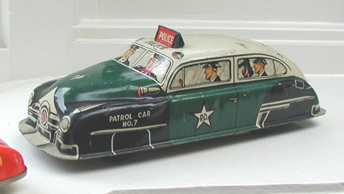
 My "COP STOP" idea
for a painting spawned out of this tin police
car. It's cool graphics made it perfect for the
focal point of a police-related image.
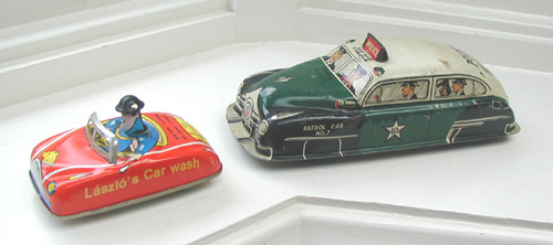
I decided that
the police car would ticket one of the local
citizens for parking in a 'police parking only'
zone. That zone would be...
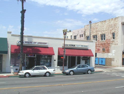
in front of
"The Donut Shop". I've chosen a strip
of buildings in Oceanside that I can 'convert'
into a donut shop. The street light, awnings and
'high lighting' will give the image plenty of
life.
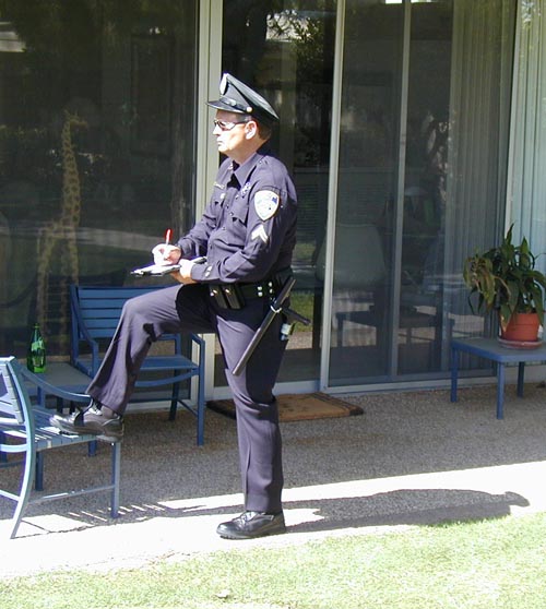
Well, no
painting about the police is worth it's weight in
paint if you don't have a police officer, and in
this case I didn't have to look too far to find a
'suspect' for my model. This is my youngest
brother, Brian who has been in law enforcement
for as long as I can remember. Although he is not
a uniformed officer anymore, he came up with the
perfect uniform to pose as my 'parking enforcer'.
Stay tuned as I begin to put all the elements
together...
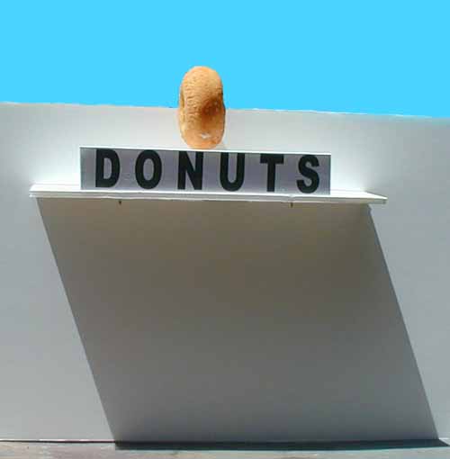
Here is a mockup
from foam board, that helps me visualize what the
donut shop should look like in terms of lighting
and impact. I've blocked in a blue sky to
simulate the sky against the donut sign. It is
obvious to me that the donut needs to be bigger
and that the 'DONUTS' letters need to be cut
out and dimentional.
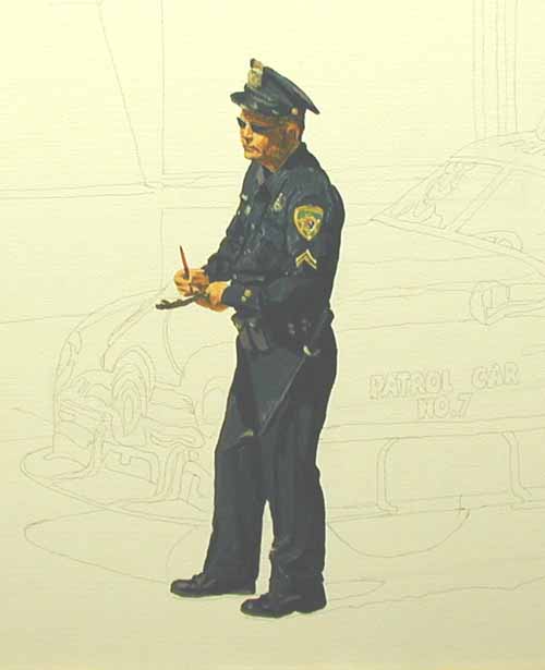
I decided to
start the painting with the police officer
writing the ticket.
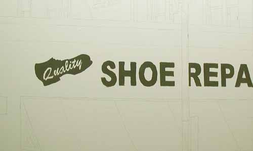
I've designed
the signage for the store next door.
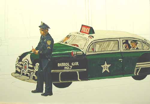
Here's the car
blocked in. Notice that the driver of the car is
not in the window.
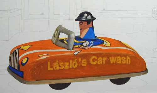
The
"Laszlo's Car Wash" promotion car is in
place. By the way, you push the 'spring loaded'
head of the driver down and the rear wheels
spin...very cool.
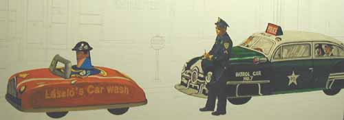
Here is a view
of the two cars on the street. I'm painting the
cars first because they have to be these specific
colors. I will base the rest of the painting's
color on these two objects.
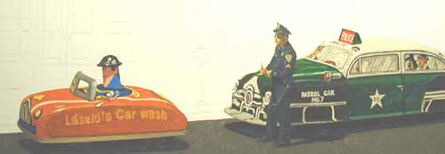
The street and
shadows are painted next to 'tie down' the cars
and officer to the ground...
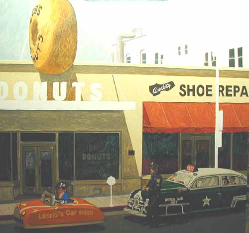
Here is an
overall photo of the painting. There is quite a
bit of glare from the overhead lights so I will
reshoot later. The two stores are taking shape.
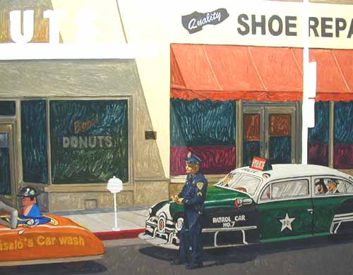
Notice the
scrubbing effect the first application of paint
makes in the window areas. That will diminish in
the final paint layer.
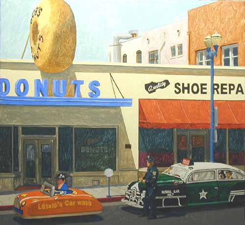
All the
preliminary painting is done. Now, I will make
the final decisions on values
(lightness/darkness) and hues (color) of each
area of the painting. The paint applied on this
'second coat' will be mixed straight out of the
tube with no thinners or medium (ie. linseed oil,
stand oil etc.).
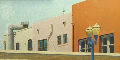
The background
buildings are completed. The large donut and the
sky will be next.
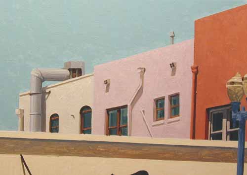
Here are the
same buildings with the sky painted with a
slightly darker value, which makes the buildings
'pop' in the sunlight.
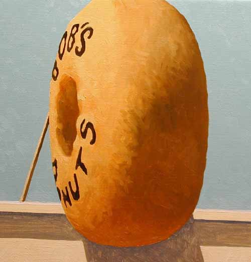
And the
donut...plain, no icing...ready for dunking!
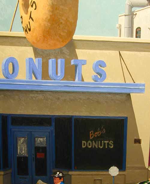
Today I painted
the building it's cream color, both the sunlit
areas and the shaded areas.
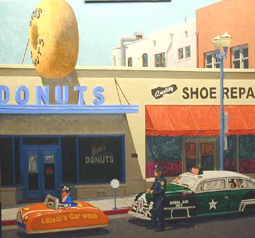
Here's an
overall look at it. Next I will paint the signage
and awning, moving down into the window areas
after that.
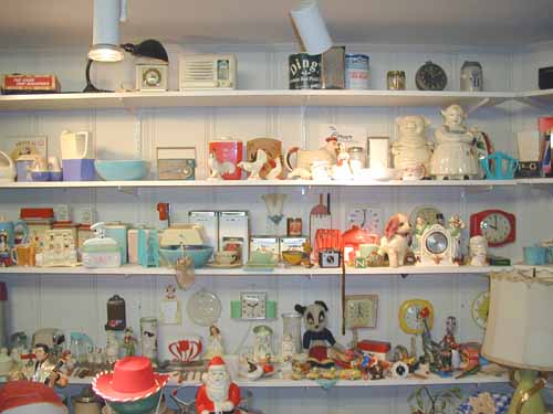
For those of you
who have emailed me and asked for a peek into my
studio, here is a shot of my back wall in my
painting area. Lots of props that have either
been in a painting or are waiting their turn...
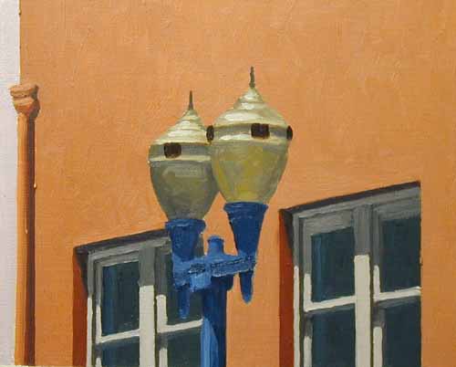
Here's a
close-up of the finished street lamps.
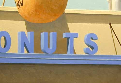
Look at the
finished DONUT sign on the overhang. I love the
powder blue color...It looks as edible as the
donut!
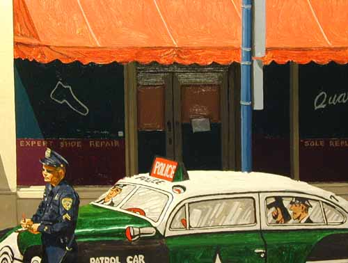
I've painted the
windows and doors on the shoe repair store much
darker to make the police car stand out.
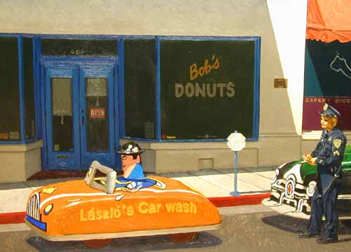
The windows of
the donut shop are also darker to make the little
tin man in the Car Wash car 'pop' optically.
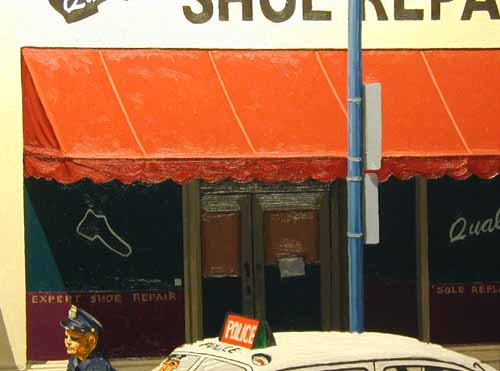
The awning was
painted, increasing the 'redness' of the hue.
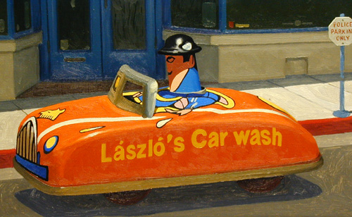
Compare the
finished 'Car Wash' car with the photo of it in
it's initial stage two photos above. Notice the
increased intensity in the hue and detail.
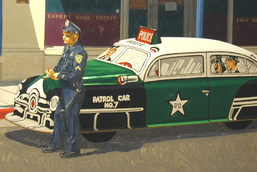
Patrol car is
done. The only things left are Brian (the cop),
the sidewalk and the street.
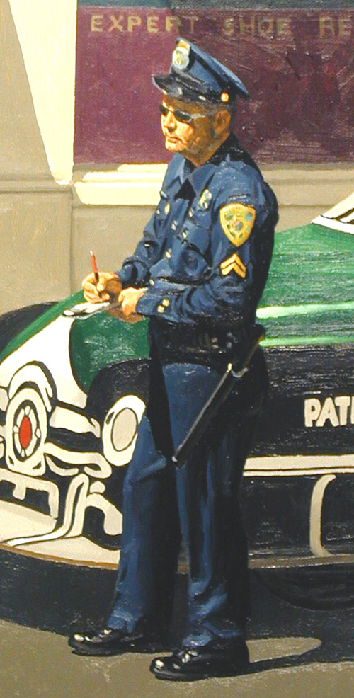
Brian looks
good. The street and the sidewalk have been
painted also...
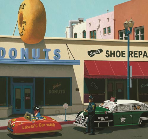
That's it!
Finished! A donut sounds good right about now!
|