|
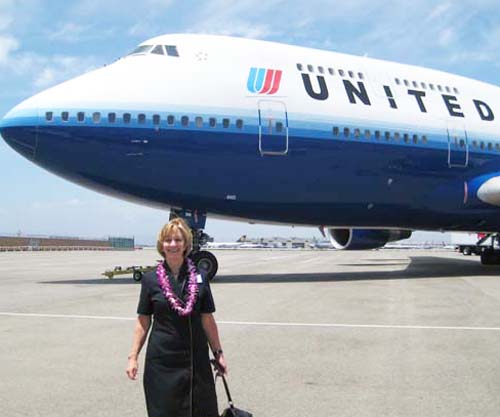
This is the story of Meredith Tunney. She worked as a flight
attendant for United Airlines for over 42 years. Her
husband Tim contacted me and asked if I could help celebrate her
career story on
canvas. I met the Tunney's over 25 years ago when they
purchased a watercolor from me, and met with them a couple of
times recently to discuss this painting project. Meredith
had gathered up some United Airlines related objects for me, and
between her and Tim, they also sent me a number of photos.
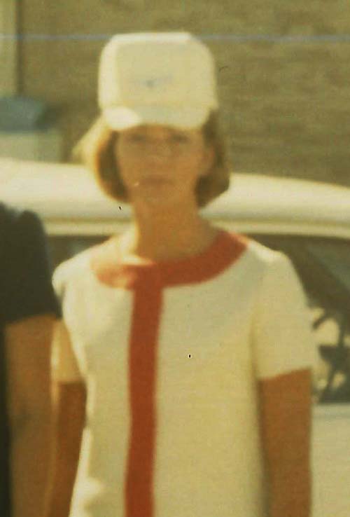
Here is one of the best photos. This is a close-up of Meredith
from a 1970 snapshot. It's a little blurry from blowing up
a small photo, but you have to agree that this is a very cool
uniform from a very hip late 1960's. Very cool Meredith also!
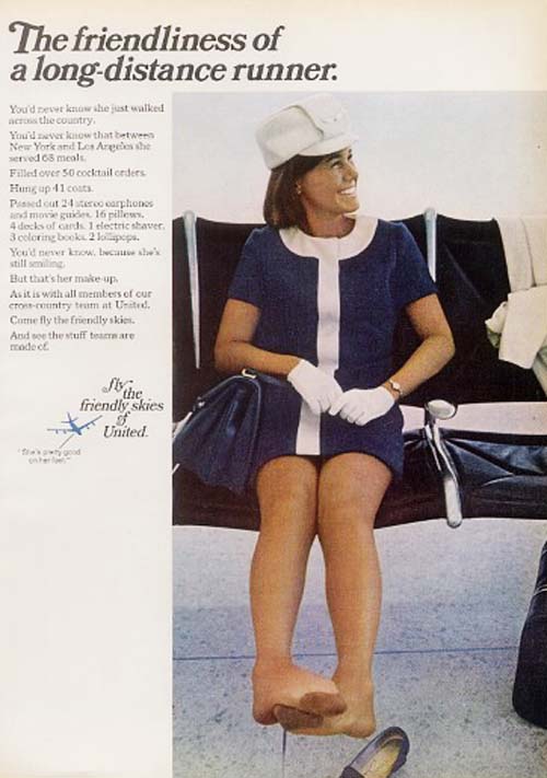
This ad from 1970 (borrowed from Meredith and Tim), shows
another color scheme used by United Airlines.
Meredith had written down all her home bases and some of the
cities that she traveled to with United, and I had her give me a
list of her favorite destinations. She had spent the last
20 years traveling to Sydney, Australia, so she had a special
connection with the land down under. LAX was her favorite
home base. With all this as a starting point, I started to
work on a theme.
Below I have started to list the items that I
will be using in the painting:
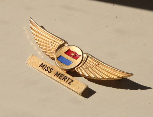
This is one of Meredith's earliest pair of wings. I love the
nostalgia and the effort put in by United by imprinting Miss
Mertz (unmarried at the time) on the built in name plate.
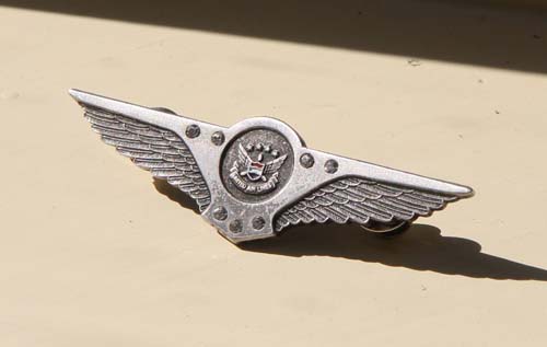
There were a number of pairs of wings that Meredith wore
throughout the years, each one denoting her tenure in the
airlines. This is the final pair that she wore when she
retired in 2012.
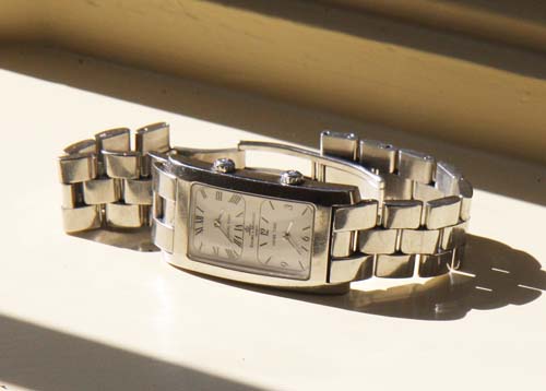
This is a special 'dual time zone' watch that Meredith and Tim
found together.
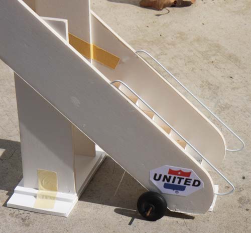
I built this passenger loading ramp years ago for another
painting. Today I revised it with handrails and an axel
with wheels.
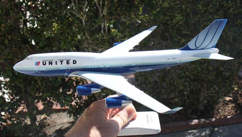
This is Meredith's favorite 747. It is specifically a
Boeing 747-400, with the Rising Blue or Tulip logo on the tail.
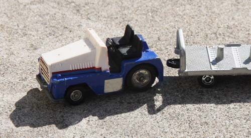
I will be using this luggage tug to tow some special baggage.
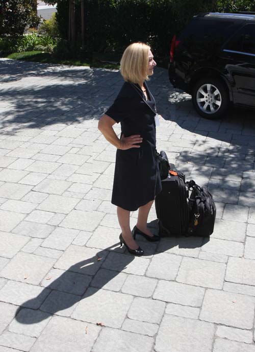
Meredith and Tim's driveway provided me with the perfect
lighting setup for her painting photo. The lighting in
this photo will dictate the lighting for the entire painting.
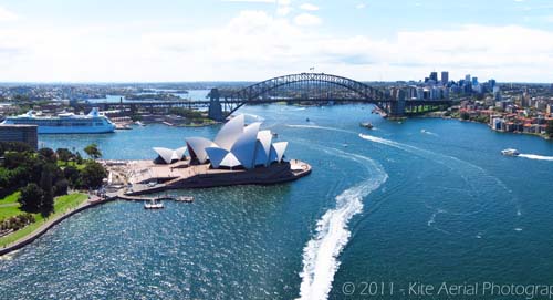
This painting will involve a view out the window and the view
will be an aerial perspective of Sydney Harbor. I found
this incredible photo on the internet and contacted the
photographer who shot it. His name is Pierre Lesage of Tahiti.
He uses a sophisticated kite to get aerial views all over the
world. I'll be using a section of this photograph. I paid a fee
to Pierre for the rights to use his photograph.
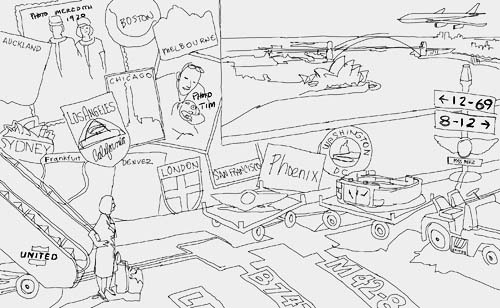
Here is a simple sketch of my proposed image.
Click on
the image to get a larger view. I have set up a scene on
the terminal tarmac at Los Angeles Airport, with Meredith
pausing at the steps of the portable stairs. She is
stopping to reflect on all that is in front of her. There
will be travel stickers pasted all over the wall to her left,
showing her favorite destinations, along with a photo of Tim and
one of their dogs and the photo of Meredith in her first
uniform. The baggage tug will be pulling two carts, one
with her dual time zone watch and the other with her last set of
wings. Her first set of wings are mounted on a runway
light post with two runway signs, which show the beginning and
end dates of her career with United. Out the window will
be the 747, gliding across the sky above Sydney Harbor.
The markings on the tarmac will show LAX, B747, and M42-8, the
amount of years and months she was a flight attendant.
That's a lot to take in from this sketch, but
I will make it more clear as I go along.
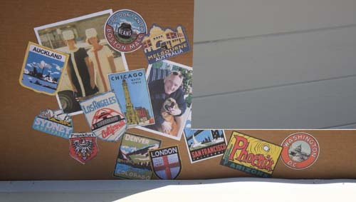
I've assembled two photos and twelve travel stickers on a piece
of cardboard to represent the wall in the painting. Notice
the open area to the upper right. That will be the window
with the view of Sydney Harbor.
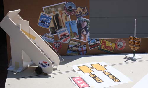
Next, I brought in the passenger stairs, some terminal tarmac
signage, and the runway light pole with its signs and Meredith's
wings. I'll shoot a photograph of this and print it, using it as
my guide in drawing the objects on the canvas. The initial
sketch helped galvanize the idea, but this prop set-up gives me
the real information for drawing the scene with the proper
perspective and scale.
Next, I'll stretch the linen canvas on the
stretcher bars and begin drawing the image on the double primed
surface.
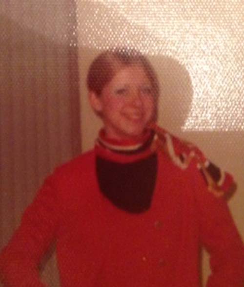
Sometimes when I communicate back and forth with a client, we
hone in on a final detail before I start on the canvas.
Meredith's best friend and United flight attendant, Debbie, was
that missing detail. I'll insert her into the photo on the
wall, standing next to Meredith back in the early days.
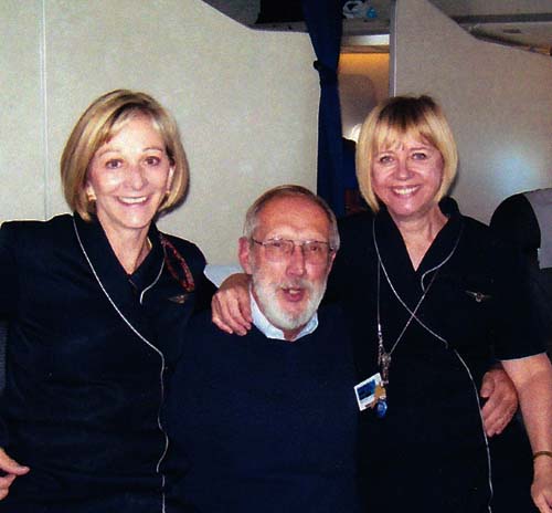
Here is a photo of Meredith and Debbie.
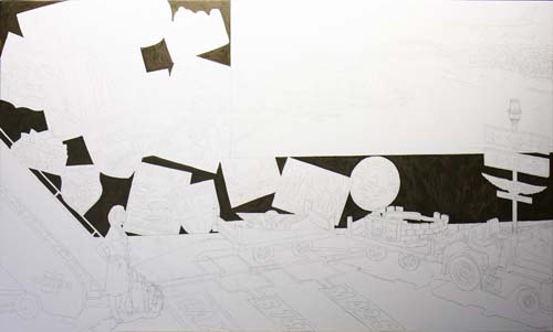
I've sketched out the basics on the canvas and have decided to
start with the back wall. My first wash of oil goes on the
wall itself, starting pretty dark so that I can create the
illusion of it being in the shade. I now will look at the
areas of the stickers and photos, pick out those areas that are
white, and mix a gray 'shade' value.
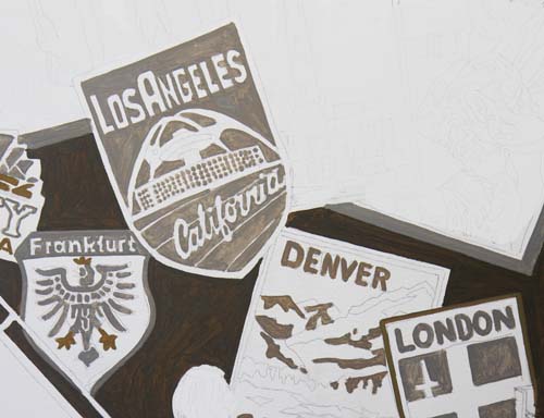
Here is a group of stickers that I've applied the grayed whites
and yellow.
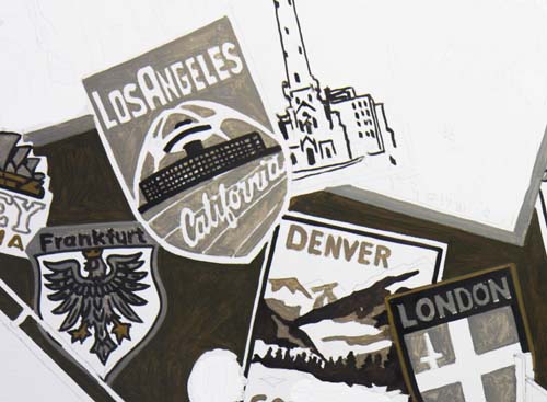
Now all areas of each sticker that have black have been painted.
Various colors will be next.
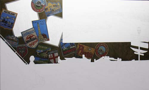
I've completed the first pass of oil on all the stickers on the
back wall. The two blank rectangular areas of canvas are the two
photos which will be next.
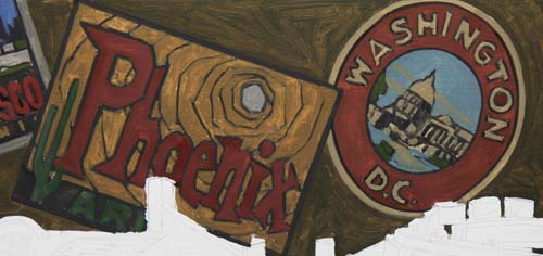
Here are a few close-ups of some of the stickers: Phoenix,
Washington, D.C....
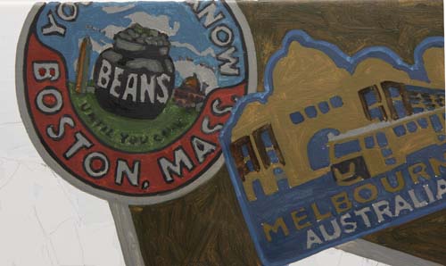
...Boston, Melbourne...
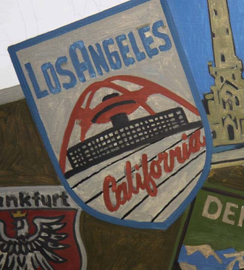
...and of course, Los Angeles (Airport).
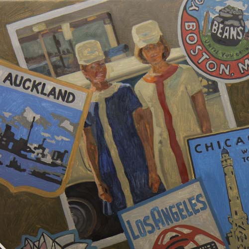
The photograph of Meredith and Debbie is roughed in.
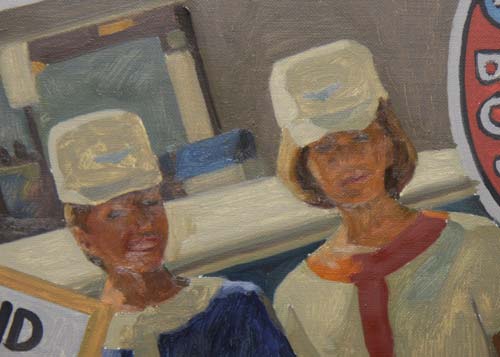
As with most renderings, especially this one in the shaded area
of the painting, the detail will be less sharp.
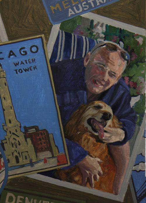
The final puzzle part of the back wall, Tim's photo, is in. I'll
move on to the tarmac next.
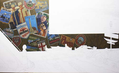
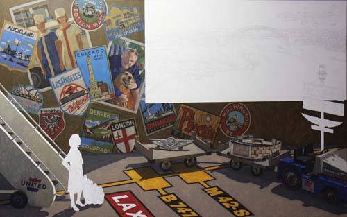
Here's a shot of the entire canvas with the semi-completed back
wall.
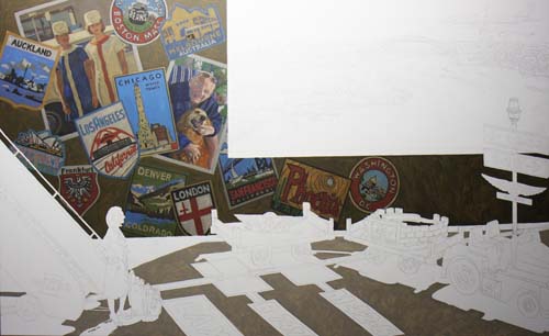
In this photo, I've applied a warm gray to the sunlit areas of
the asphalt tarmac.
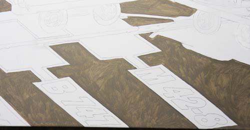
This is a close-up of the lower center.
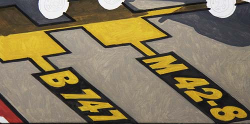
Now, with the markings on the asphalt sketched in.
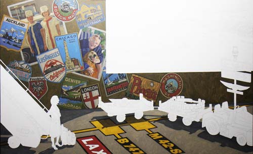
Here is the entire canvas. I will move on to the other
objects on the tarmac, beginning with luggage tug and carts.
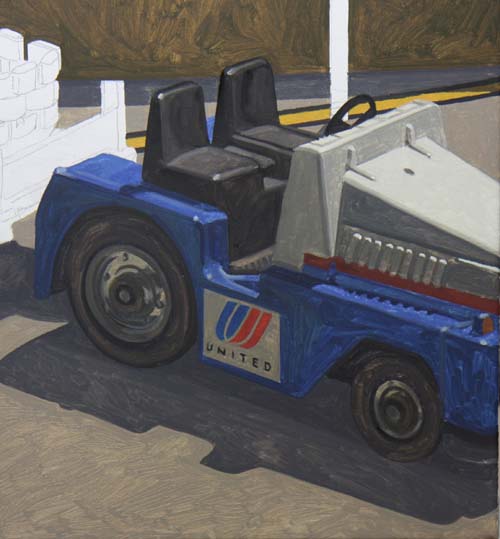
The baggage tractor or 'tug' has one of United's logos on the
side.
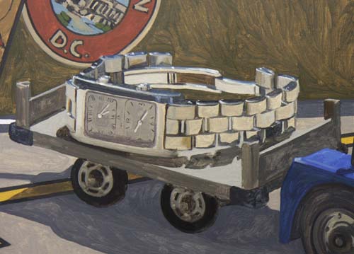
The first cart is rendered with the dual time zone watch as its
cargo.
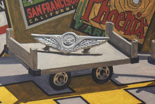
The second cart now has Meredith's final set of wings.
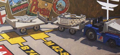
And here's a view of the two carts.
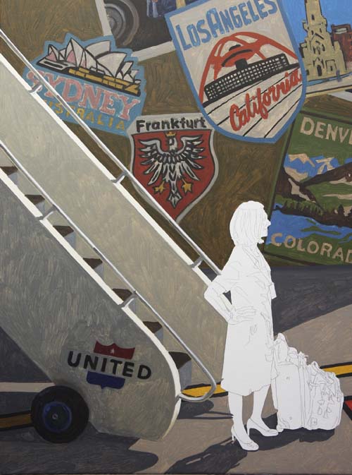
The passenger stairs now glow with their dramatic lighting.
I'll move to the right side of the painting next and brush in
the pole light with the signage and wings on it.
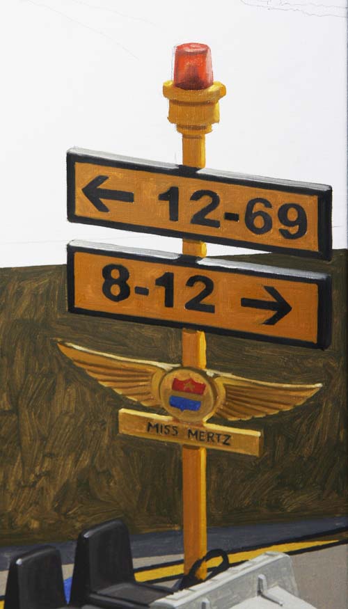
The light pole is in and only Meredith is left in the foreground
area.
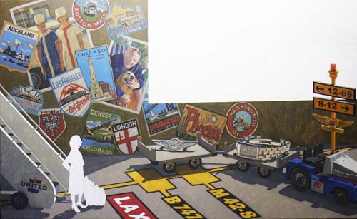
Here's a look so far.
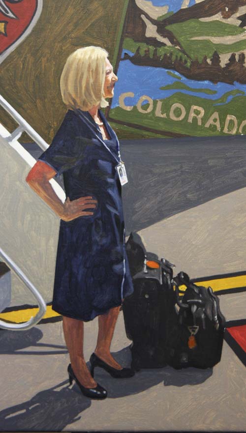
Here is where I put a lot of effort, trying to get Meredith's
likeness for the painting. As with any 'portrait', the
artist interprets what he sees. Although this is only the
rough rendering phase, I think I got real close to the real
thing.
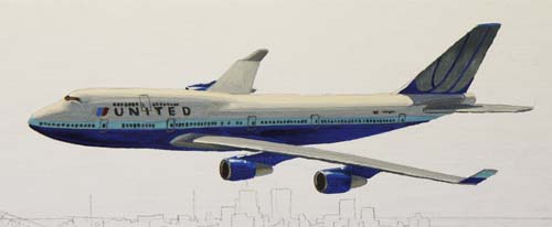
I've moved outside to the window and have rendered the 747
first. When you view the next photo, where I've put in the
blue hue of the sky, you can see...
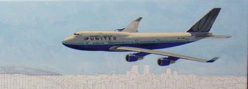
...the highlights of the white areas of the aircraft because of
the contrast in the two values.
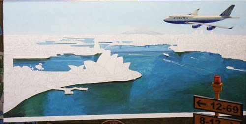
I've painted the overall cast/design of the water first, which
will dictate the value range of the rest of the scene.
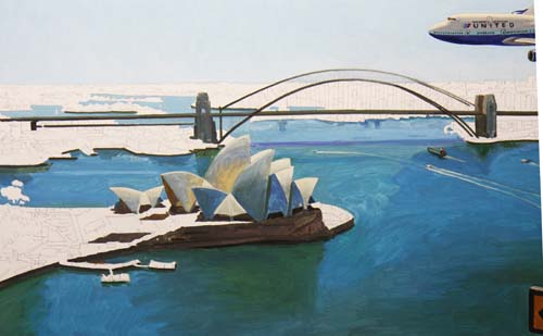
The Opera House is roughed in and I also put in the arches of
the bridge so that I wouldn't lose my drawing when I paint the
areas behind it.
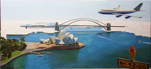
I'll begin with landscape in the lower left section of the
window and work up and around to the right.
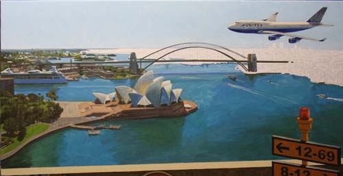
Working my way up to the horizon line on the left.
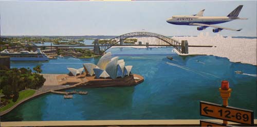
The bridge structure is forming and I'm painting the landscape
behind it.
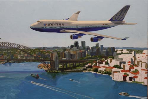
Starting the cluster of buildings and...
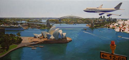
...here's a view of the whole window so far.
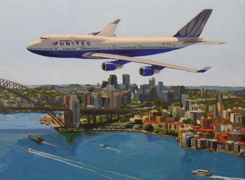
The buildings are completed and...
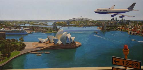
...here is the completed window.
Click Here
to see a larger image of the window.
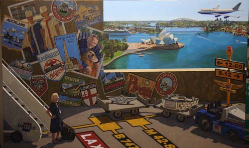
I've completed the first phase of the painting, addressing each
area of the canvas with a thin layer of paint. Now, I'll
start over and repaint every square inch with heavier oil paint,
making adjustments in hue and value and putting a little more
detail where needed.
Click Here to view a larger image of the entire
canvas.
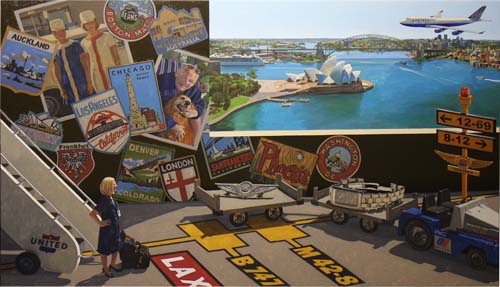
The back wall will be the first area to get the final paint.
Since I decided that the wall needs to be darker overall to make
a definite separation between the interior scene and the window
image, I've darkened the wall areas without travel stickers
first.
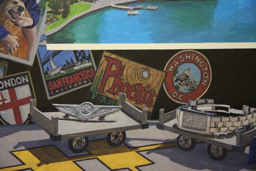
Here's a close-up of a section of the wall. By darkening
the warm brown of the wall, the stickers immediately become
comparably lighter, which is what I want this first paint
application to show me. I'll then darken the stickers so
they don't pop off the wall.
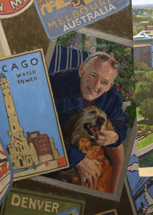
Since the photo of Tim boarders the window edge, and because the
window edge's value or darkness is important for the optical
separation between it and the window image, I've started here.
I darkened the white areas first (the white photo border
especially) and adjusted the rest of the photo to the darker
border.
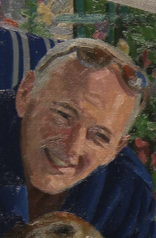
Here is a close-up of Tim's face to show the thicker paint
application. As with many of my commissioned paintings,
there are areas throughout the painting that are smaller
paintings all by themselves. This portrait of Tim was
rendered with a #1 bright bristle brush (about 1/4" wide),
keeping the image more painterly than photographic.
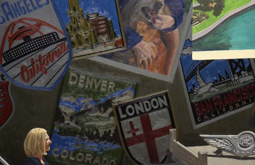
I've been working on the back wall for about a week now.
Everything needed darkening, based on the photo of Tim.
You can see that the various travel stickers are quite darker,
but still have enough contrast and detail to be seen clearly.
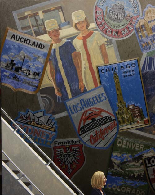
I've darkened all the stickers on the left side of the painting.
Notice how the photograph of Meredith and Debbie glows on the
wall. This shows that it will need the same 'darkening' as
Tim's photo. Also notice how the darker background makes
Meredith's hair and face stand out. This is the reason for
darkening the background and its success is quickly apparent.
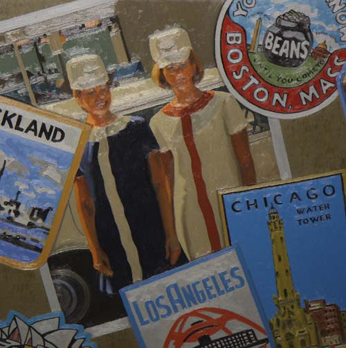
This photograph is finished. Aside from the glare of my
studio lights, you can see that Meredith and Debbie's photo has
darkened and taken its proper visual place on the wall.
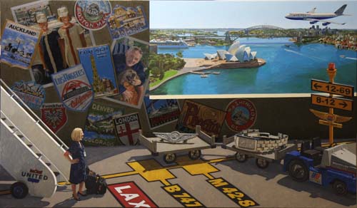
The entire wall is finished, and now with its overall darkened
value, it does its role of making the window look like a window.
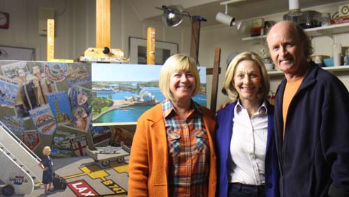
Meredith and Debbie came by the studio today to see the
painting.
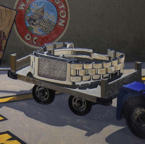
The first cart with the dual time zone watch is finished.
I'll wait to paint the cast shadow when all the objects in the
foreground are completed. That way I will be able to tie
them all together with the same shadow color and be able to put
in the proper value based on all the objects.
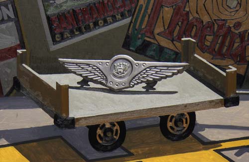
The final set of wings and cart are completed. Now, on to
the tarmac light pole.
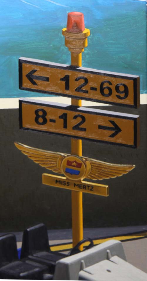
The finished light pole.
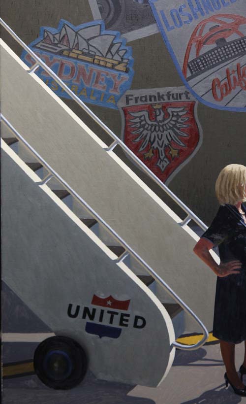
The stairs are now done. Making the handrails straight
with three different values (highlight, reflective light and
dark center) was a real challenge.
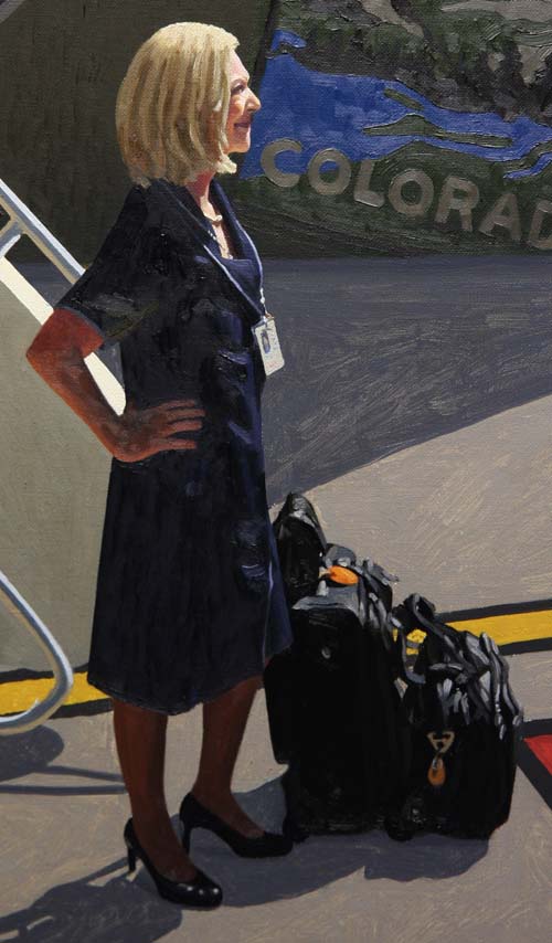
Meredith and her luggage are perfect! Now all the objects
in the foreground are completed. I'll begin to paint the
surface that they sit on, starting with the shadows.
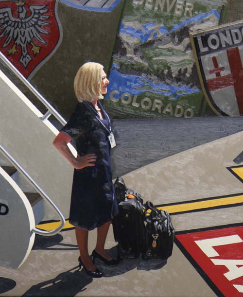
All the shadows and sunlit areas on the tarmac are complete.
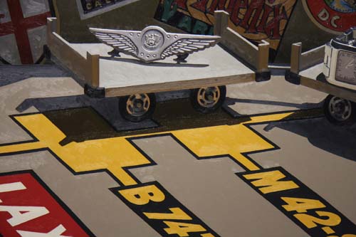
Here is another close-up shot of the tarmac.
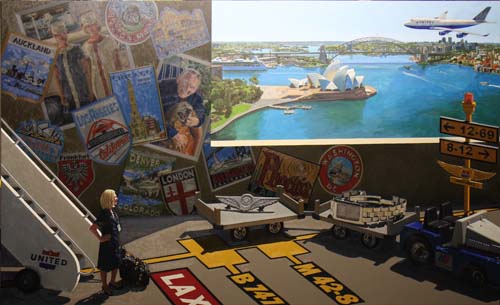
The final step will be to paint the scene in the window,
beginning with the detail on the airliner.
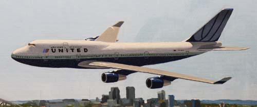
The 747 is done. Had to have my steadiest hand to do those
windows.
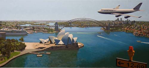
The window to Sydney Harbor is complete.
Click
Here to see a larger photo of the window.
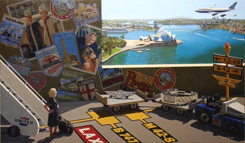
"Meredith's Friendly Skies" is finished.
Click Here to view a
larger image.
|