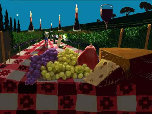
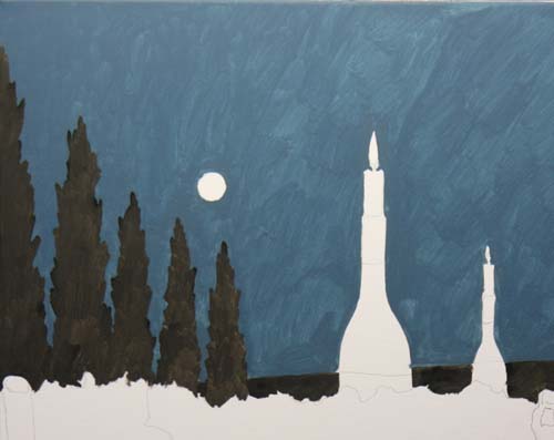
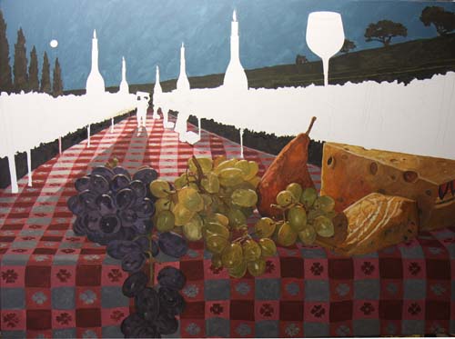
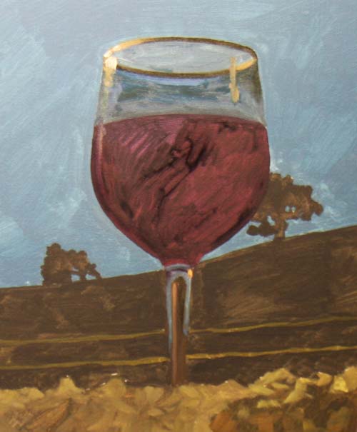
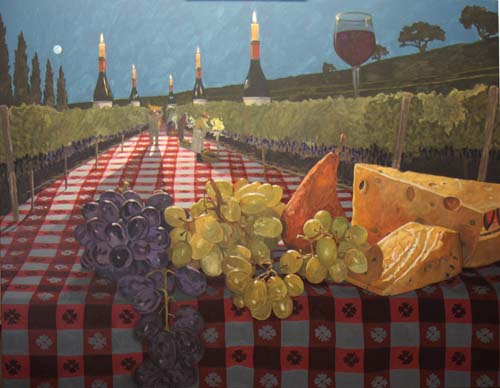
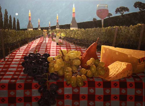
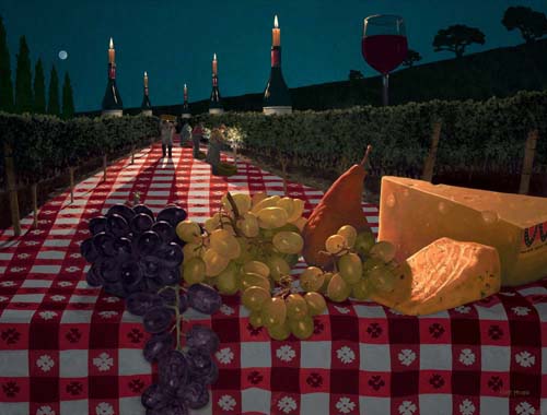
"Night Harvest"
will be 38" x 50" and will be painted with oil on linen
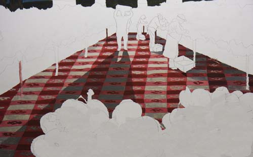
canvas. The sketch above shows a calm night in the vineyard during
harvest season. Besides the head lamps worn by the
pickers, I've lit the row with candles, burning on top of some
Pinot Noir bottles. A selection of cheese and fruit is
displayed in the foreground on the edge of the tablecloth.
Click Here to see
a larger photo.
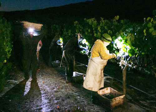
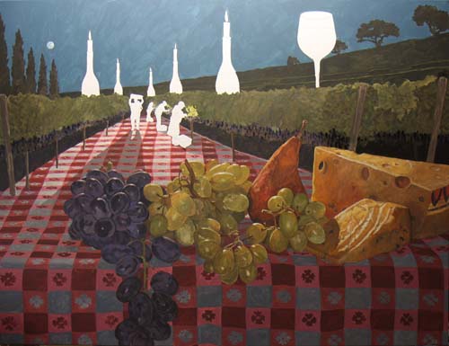
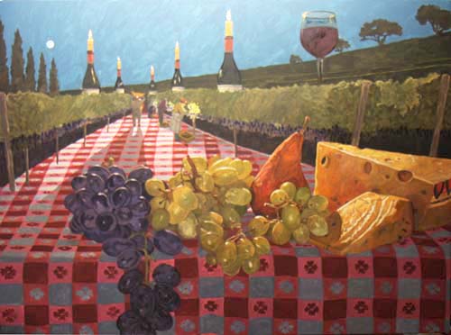
Here is the photo that was the inspiration for the painting.
It was taken by professional photographer,
Richard Green (richardgreenphotography.com)
for Roar Wines (roarwines.com).
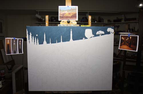
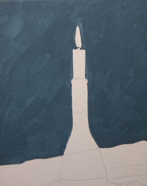
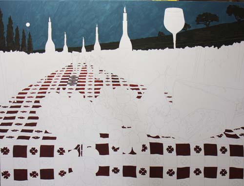
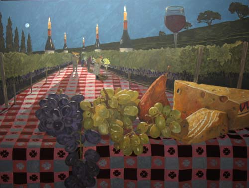
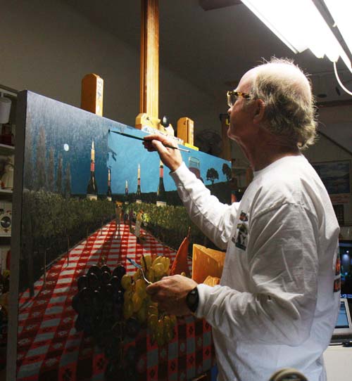
This photo gives a good idea of how I set up my canvas on the
easel. I've positioned the overall idea sketch at the top
of the canvas and two other photos of candles to the left and
right for reference as I block in the dark grayed blue of the
sky.
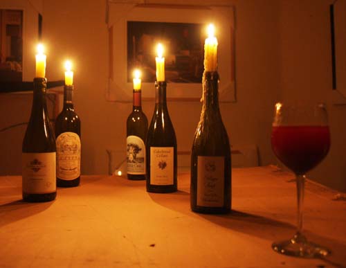
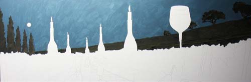
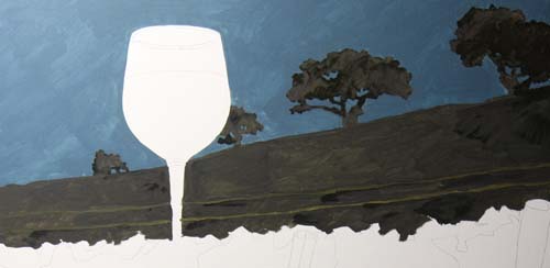
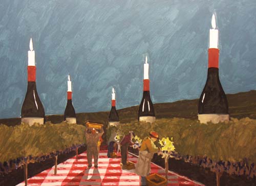
I've put candles into some wine bottles and observed the light,
the shadows and the reflections in the bottles and the wine
glass.
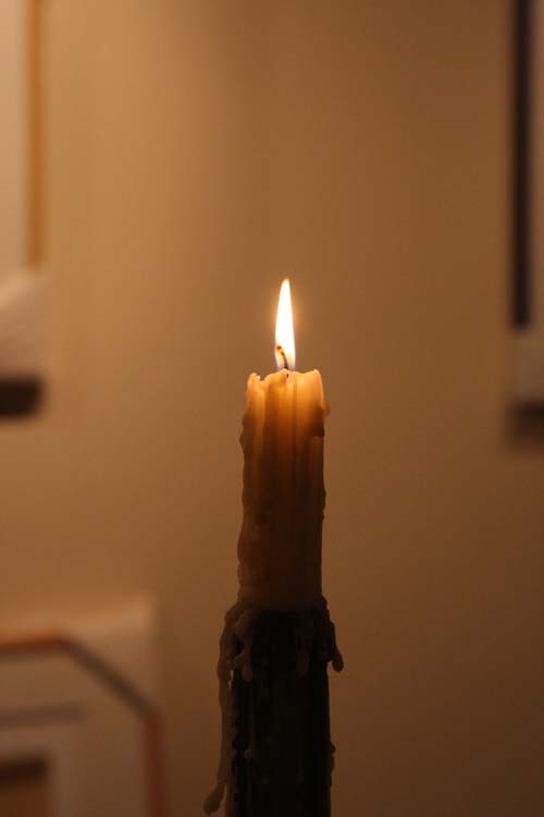
Here's a close-up of one of the candles and the flame.
This close-up shows the thin
consistency of the first application of paint. It looks
like a watercolor wash as the turpentine thins out the pigment.
The Cypress trees on the left and
the distant hillside and oak trees appear as silhouettes against
the sky. When painting this thin layer on to the white
linen canvas, it is hard to achieve the darkness that I will
want in the end product.
Here is a closer look at the right
side of the painting and...
...a look at the left side.
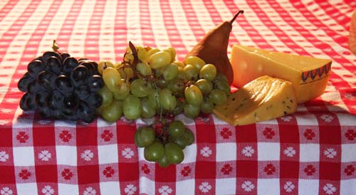
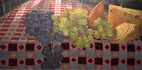
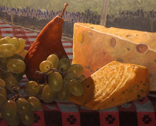
I set the fruit and cheese on the tablecloth. I wanted the
cheese to be a little bigger in comparison to the fruit so I
will draw it larger.
Next, I've decided to define the
tablecloth. It has an edge in the foreground that appears
to hand off of the tablelike design of the image.
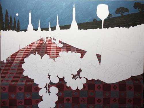
I've worked out the rest of the
tablecloth, putting in shadows and shading in approximate areas.
I will have to adjust all of these dark areas after I get the
other objects painted in.
One of the dramatic areas of the
painting and also the focal point will be the man carrying the
tub of grapes over his head. His shadow cast from the head
lamp forms an interesting pattern on the tablecloth.
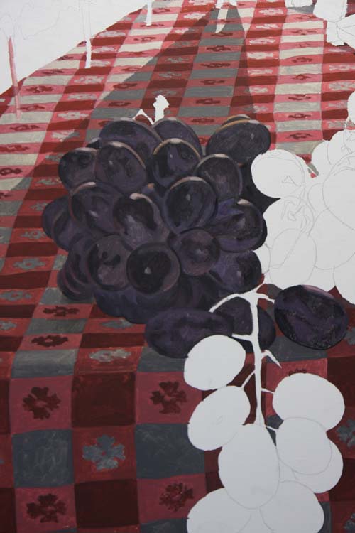
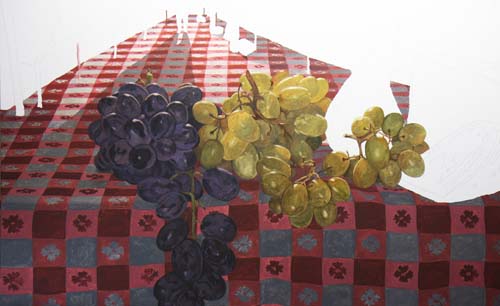
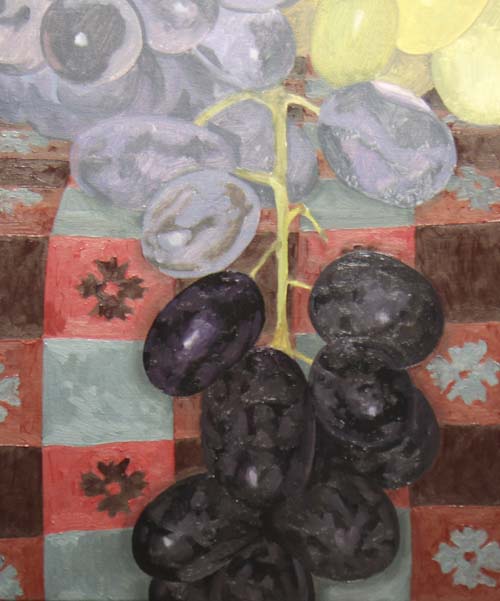
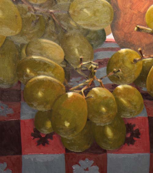
I've used table grapes in the
foreground. Notice on these dark grapes the different surface
treatment, showing both the shiny and dull areas of each grape.
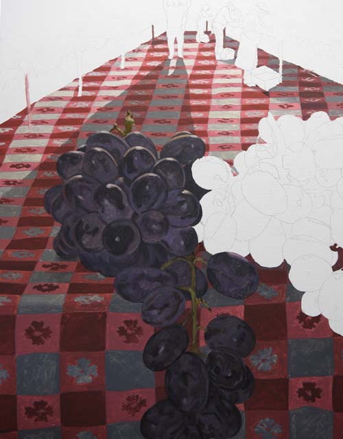
The black grapes are finished for
now. I will come back in the second phase and darken the
tablecloth areas that are close to the grapes.
The green grapes are rendered for now. Notice that they
are not one perfect bunch of grapes, but a combination of three
small clusters.
Here's a look at the bottom portion
of the canvas.
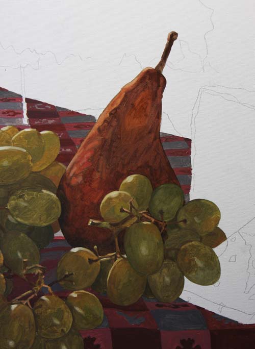
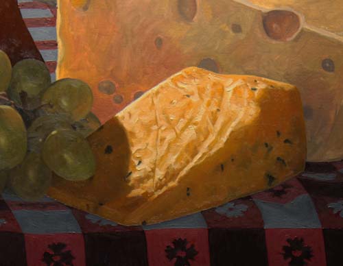
The Bosc pear is nestled in amongst the grapes.
The slice of Yarlsberg cheese is rendered. All of these
objects will be adjusted for color and value when the painting
has received its first layer of paint.
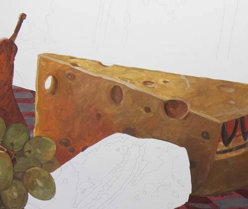
The smaller slice of cheese, with its dark herb specks is done.
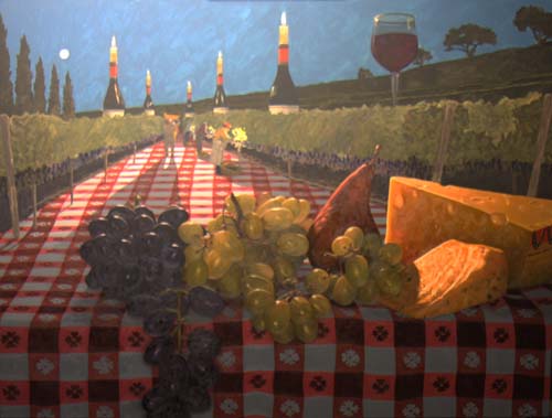
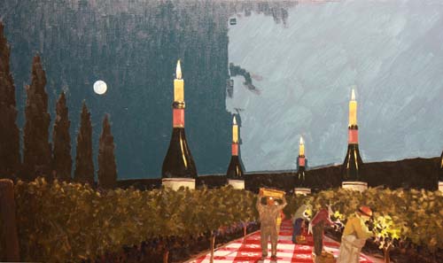
Here's an overall look at the
canvas. I've painted the dark areas under the rows of grape.
I've applied a simple value for the
two rows of vines on the edge of the tablecloth.
I painted in the pickers with some simple brush strokes, saving
the detail for later. I've also begun painting the wine
bottles.
The candles and their reflections in the bottles are rendered
simply.
The wine glass is blocked in with the thin oil washes.
Here is a look at the entire
canvas. All areas have been painted with thin wash of oil.
Adjustment of hues, values and detail will come next.
In this final stage of the painting, I'll apply tube thickness
oil over the thinly applied first coat. It is my intention
to make this the final application, adjusting the hue and value.
If the drawing needs tightening up, this is the time for it.
I'll start on the tablecloth. In this photo, I've painted
the darkest red squares and flower motifs with a blackened red.
I combined alizaron crimson, cadmium red and ivory black.
Here's a detail of the front edge of the tablecloth with a
little more light in the photo. Notice how the dark red
squares make the other squares look too light. This
comparison is what I look at when determining how dark to paint
the lighter red squares.
With all the squares darkened
appropriately, the front edge and the areas under the fruit feel
like they are in the shadows. This darkening of the
tablecloth has made the fruit too bright, so that will have to
be adjusted.
I've begun to paint the black
grapes, starting at the bottom of the bunch. You can see
how much darker they needed to get to keep their proper
relationship with the tablecloth.
The black grapes are painted, all
except for the stems. You can see how the stem pops out
visually because it is too light in comparison to the grapes and
tablecloth.
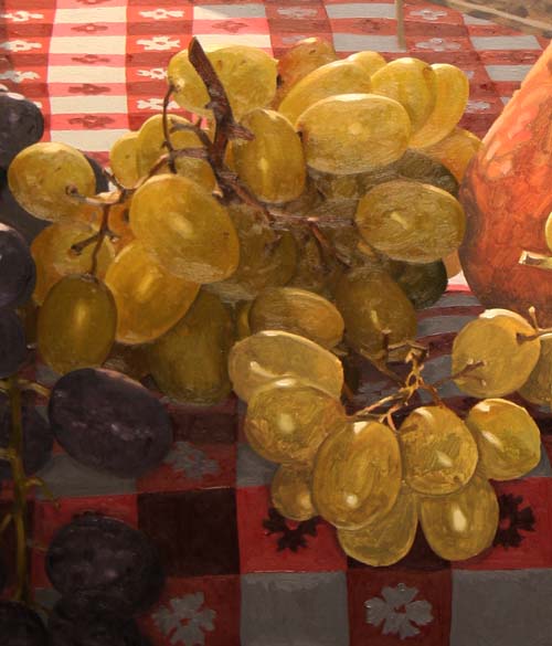
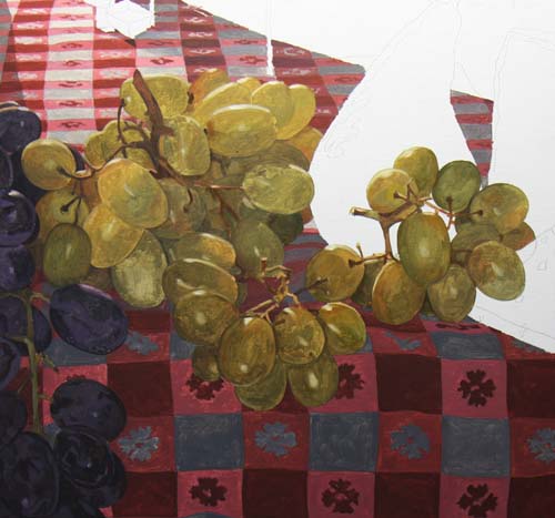
The top portion of the green grapes
are painted with their final values and hues. They are
quite a bit darker than they were in the first passage of paint.
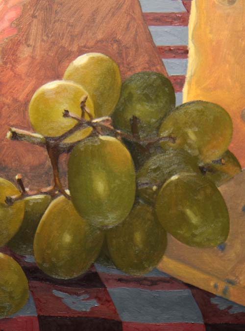
All the green grapes are finished. Even though they are
green, they have some red hues in them from the lighting, the
pear and the cheese.
Here's a close look at the little clump of grapes on the right.
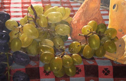
This photo shows the loose clumps
of grapes. The pear and the cheeses look pale, now that
the grapes have darkened.
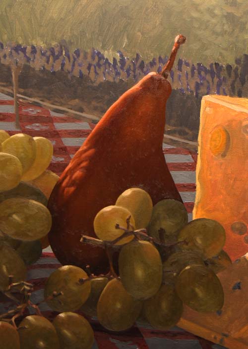
With the pear darkened, notice how it makes the grapes 'pop'.
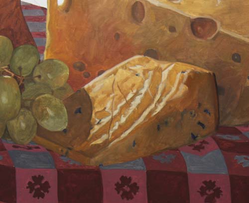
The smaller slice of cheese has been both darkened and I've
strengthened the hue overall.
This photo shows the result so far. I'll paint the larger
piece of cheese and then shoot a photo of the entire canvas.
The foreground is finished. Now I'll try and establish the
correct values for the rows of grapes so that the lights from
the workers' flashlights take effect.
I've begun to put more dark detail
into the grape vines.
Click Here to see a larger image.
The cypress trees on the left, the
distant hill and the oaks on the right have been darkened.
They're new dark value makes the sky look too light, but also
makes the grape vines brighten. So, let's darken the sky!
Here I am, applying a darker valued
layer of oil on top of the initial sky color.
This straight on view shows just
how much darker I am painting the sky with this tube thick
passage of pigment.

I'm not sure why my camera
interprets the color of the sky differently between photos, but
here is an image of the finished sky. The actual color is
much closer to the previous photo.
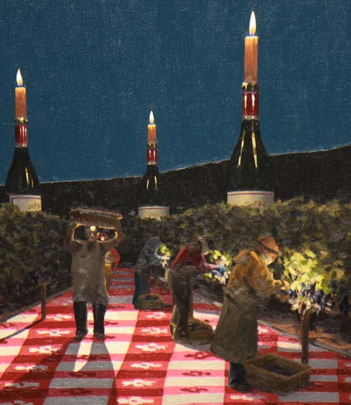
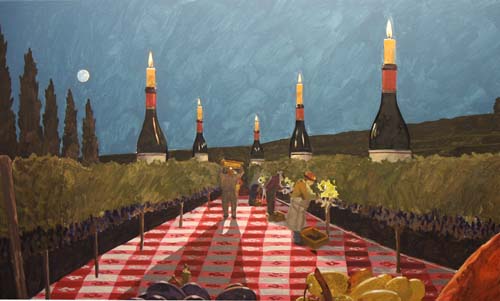
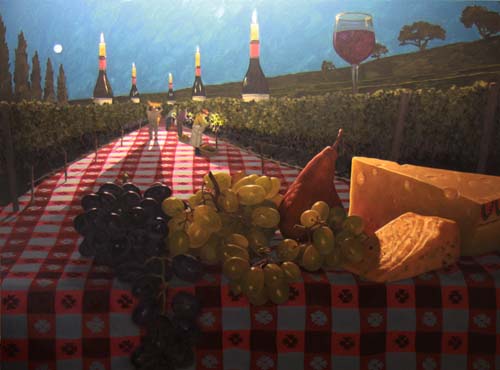
The pickers are finished, along with the vines and bottles.
The painting is completed. You can
Click Here to
see a larger version.
|