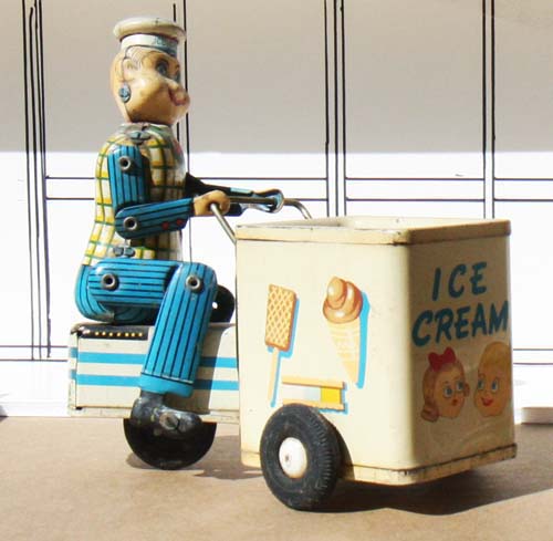
I sat down in my studio
the other day and looked at all the tin toys I hadn't included
in a painting. This ice cream vendor was one of them. I
immediately thought about the neighborhood ice cream man but
knew that I had painted that subject many years ago and I wanted
to tackle a subject that hadn't seen the canvas on my easel.
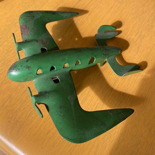
I also looked at this metal
airplane, whose unique design has always intrigued me. I
asked, "How could I incorporate both of these objects in some
fun story?"
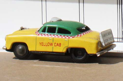
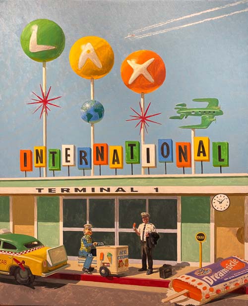
I decided that I could mesh
the two toys, along with this toy taxi cab, into a scene at an
airport terminal.
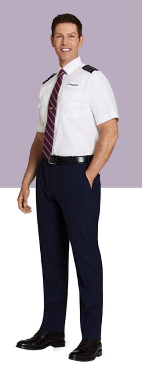
I could have my model be an airline pilot...at
LAX!
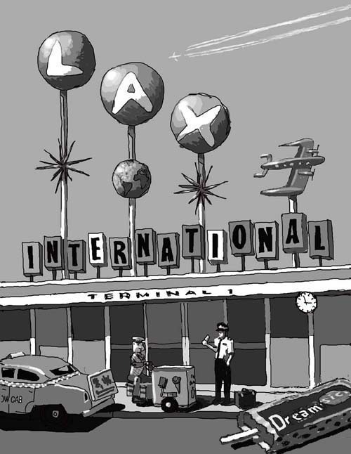
Yes, LAX with a cool atomic era mid century
terminal building. And since my vision was of a single story,
low-key structure, with a 1950's - 1960's vibe, I would need to
build it myself. In the scene, a pilot stops before entering the
terminal and has a cool treat...a popsicle Dreamsicle, sometimes
called a 50/50 bar.
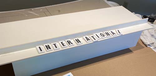
I cleared off my packing and shipping table,
found some scraps of foam core board, and began to put it
together. After gluing the letters to 'INTERNATIONAL' on to the
foam core board, I cut them out and mounted them to the building
with toothpicks.
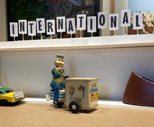
It was obvious that I would have to adjust the
scale of the different objects to fit the scale of the building.
As you can see here, the ice cream vendor towers over the taxi
cab.
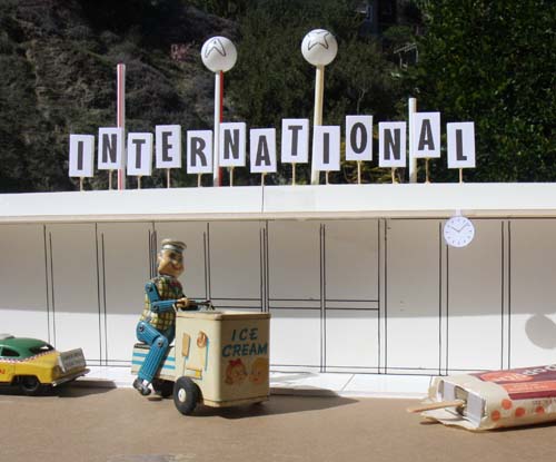
I drew the doors and windows of
the terminal on the board with a felt tip marker and brought the
building outside in the sunlight. I also had decided to use an
old Popsicle wrapper and cardboard ice cream as a prop for the
Dreamsicle.
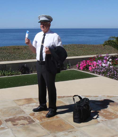
My golf buddy, Phil, is the pilot in this painting. I've painted
a number of my friends and golf buddies, and Phil has always
displayed the cool and confidence of an airline pilot. I used my
retired Marine Corps dress hat once again to represent a pilot's
hat. I think my models have worn it more than I had a chance to
wear it back in 1970.
Phil looked perfect for the part when I showed
up to photograph him. Just like I had imagined a pilot would
have been prepared for take-off!
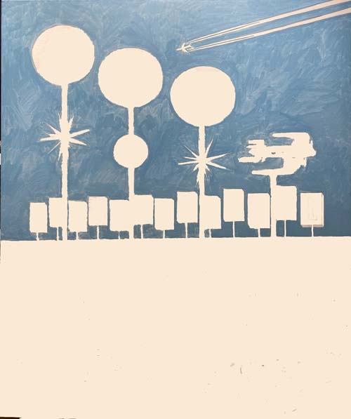
Here is a photo of the entire canvas. I've chosen to paint this
image 40"x32" and stretched the finest linen canvas over the
stretcher bars.
I'm starting in the sky with the sky color, a
mixture of thalo blue, French ultramarine blue, cadmium yellow
and white.
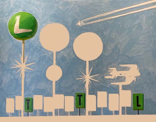
I've coordinated the colors of the 'LAX' globes with the letters
in 'INTERNATIONAL.' First the green...
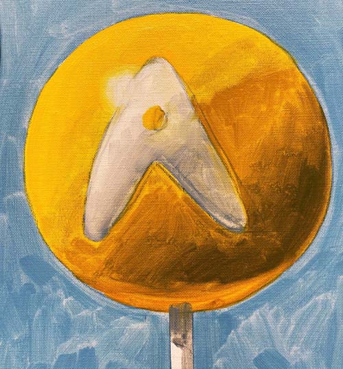
...then the yellow on the globe and...
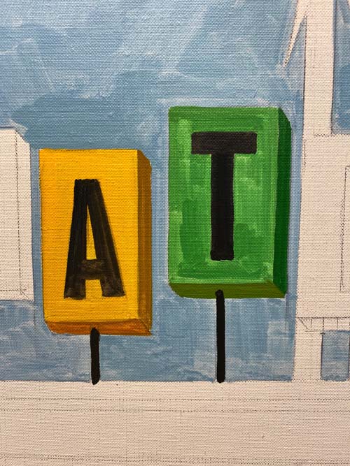
...on the letters.
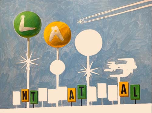
Here's a look at those two colors.
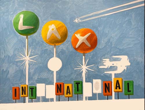
The orange was next and then...
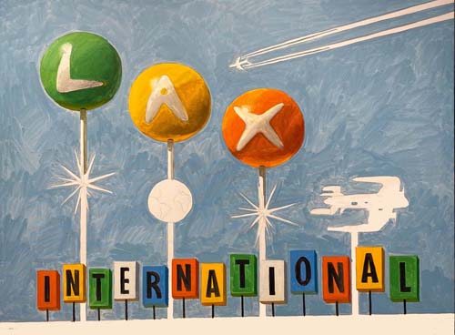
...the blue.
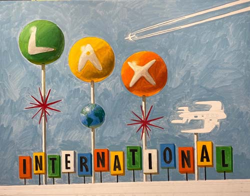
The world globe and the two red starbursts are painted in as
well as the...
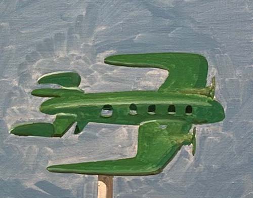
...airplane. Notice how you can see through the windows.
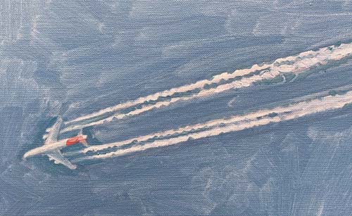
The jet and its contrails are developed a little further and...
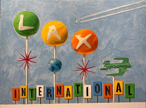
...the upper half of the painting is 'blocked in.' The paint
applied in this early stage is thinned out with turpentine,
painted almost like a watercolor. After the entire canvas has
one layer of this thinned pigment, I'll adjust the values and
hues with a final thick layer of oil paint.
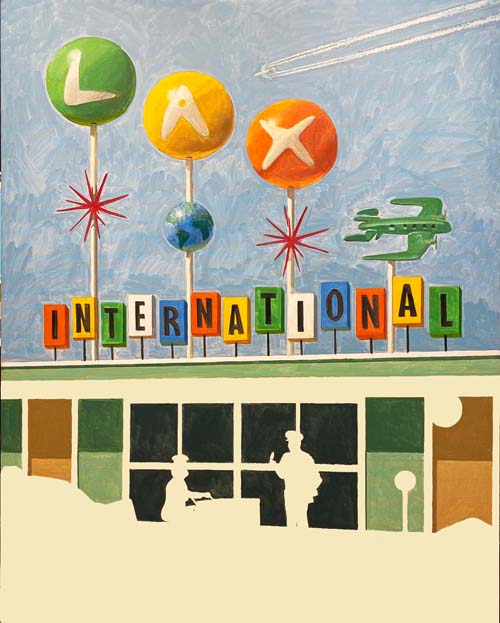
I've begun to paint the building. Attention to cast shadows from
the overhang is paramount. I've chosen an institutional green
for the overall building color which will be perfect for the
mid-century look I am going for.
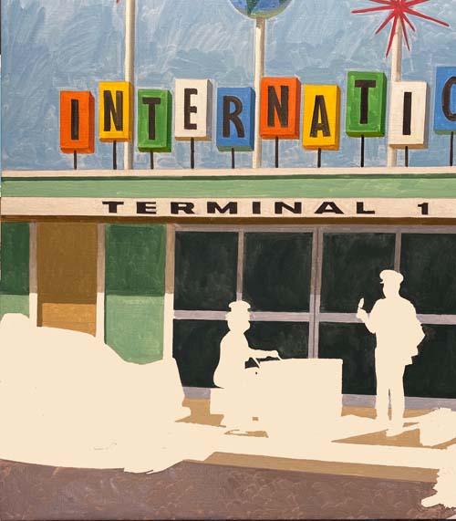
I'm continuing my work on the lower part of the canvas, painting
the 'TERMINAL 1' on the edge of the overhang and the various
hues on the automatic doors, sidewalk and street.
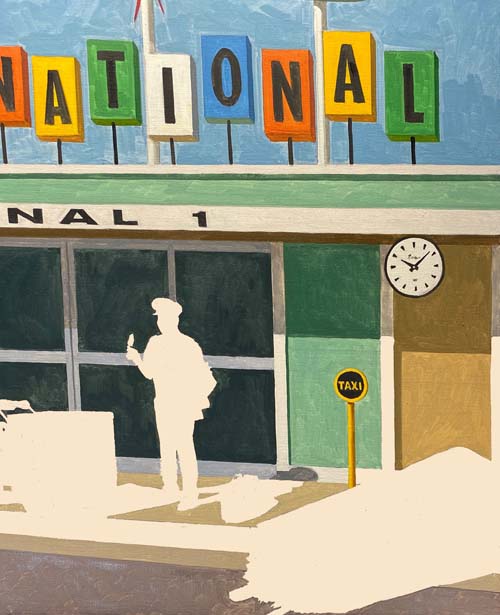
The taxi sign is now yellow and black and the clock is roughed
in.
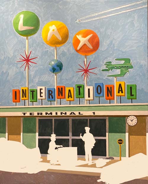
Here's an overall look at the whole canvas.
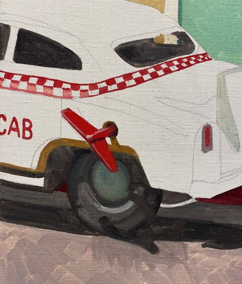
As I've done on a number of tin toy cars in my paintings, I've
added a wind up key to the side of the car so that it doesn't
look like a real automobile.
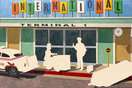
That is all for today. This photo shows how far I've progressed
throughout the lower half of the painting.
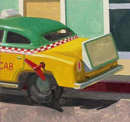
The taxi cab is done for now. I'll decide later what to put on
the advertising board on the trunk of the car.
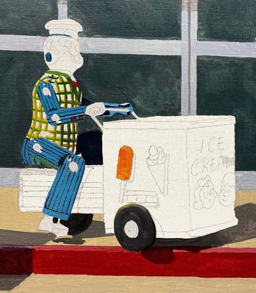
The ice cream vendor is next. I'll begin by painting in the
detail on the tin figures clothing.
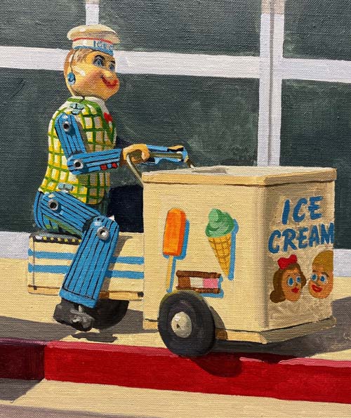
All areas of the ice cream vendor are painted with its first
layer of pigment.
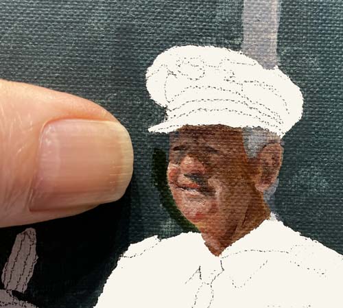
The final object to be painted is Phil, the pilot. I've included
my thumb in the photo to show how small this portrait is. I've
used 00 sable bright and round brushes to put in all the details
of Phil's face.
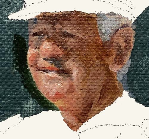
Here's a closer look, showing that even though this is the
'thin' layer of paint, I've used some 'straight from the tube'
thickness of pigment to get this initial rendering.
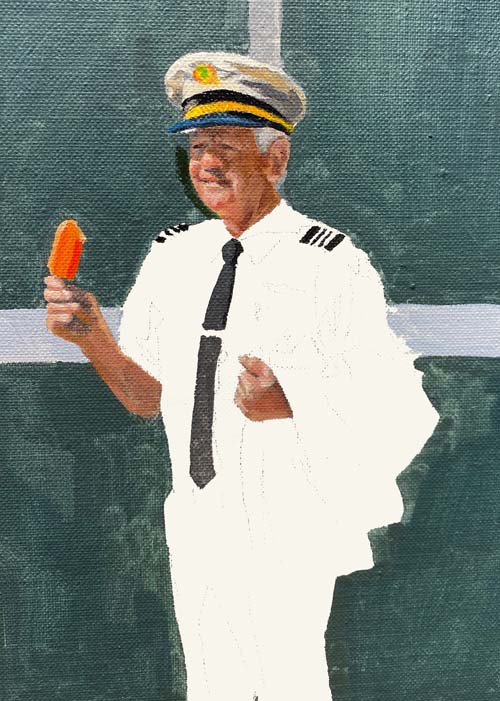
I've painted his hands and arm and begun to render his uniform.
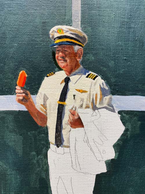
All the folds and creases of his white shirt require subtle and
some not so subtle gray pigment, comprised of French ultramarine
blue, burnt sienna, new gamboge and white.
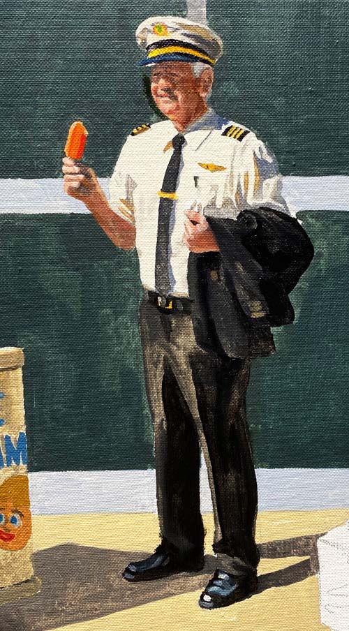
The dark black shades of his jacket and slacks really set off
the white of his shirt. Lookin' good, Phil!
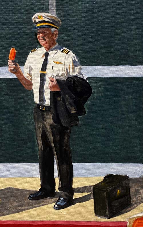
With his flight case knocked in without much detail, the entire
painting has been covered with the first layer of paint.
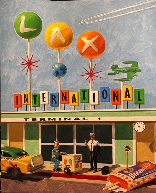
Here's a look at the entire canvas. Now, I will evaluate each
area of the design, making mental notes where to increase the
values. I'll do that in some areas with darkening the hue with
color and other areas with addition of black or gray mixed in
with the final layer of pigment.
My first final layer of pigment goes in the sky. I've altered
the color to be comprised of thalo blue, new gamboge and white.
It was the biggest passage of color in the painting, cutting in
and around the LAX International sign.

I mixed up all the colors for the 'INTERNATIONAL' sign. Each
color had three separate hues, one for the face of the letter
which is hit with direct sunshine. Another mixed for the side of
the letter that was in the shade and a warmer mix for the bottom
of each letter, showing the effect of the sun reflecting light
from the roof.
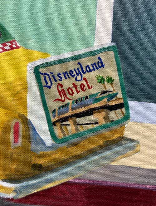
I had been pondering what to put on the advertising space on the
rear of the taxi. My wife, Carol, suggested Disneyland and I
went a little further and decided on the Disneyland Hotel. I
looked at some old photos of the theme park and chose the
monorail as an iconic Disneyland attraction to complement the
recognizable lettering of the park and hotel.
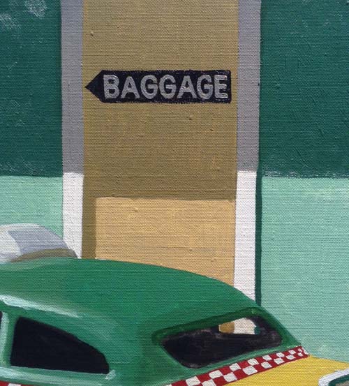
Added a baggage arrow to the exterior wall today. Bringing
reality into this surreal image.
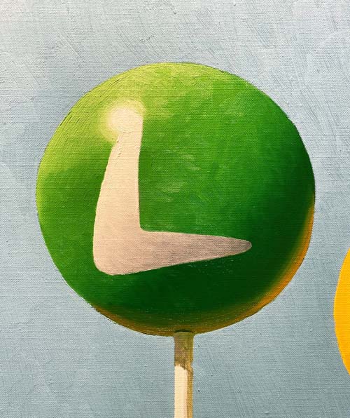
Each ball was painted with 4-6 values of green, yellow and
orange. The reflected light from the yellow ball shows in the
lower right hand area and the warmth from the rooftop glows in
the very bottom of each ball.
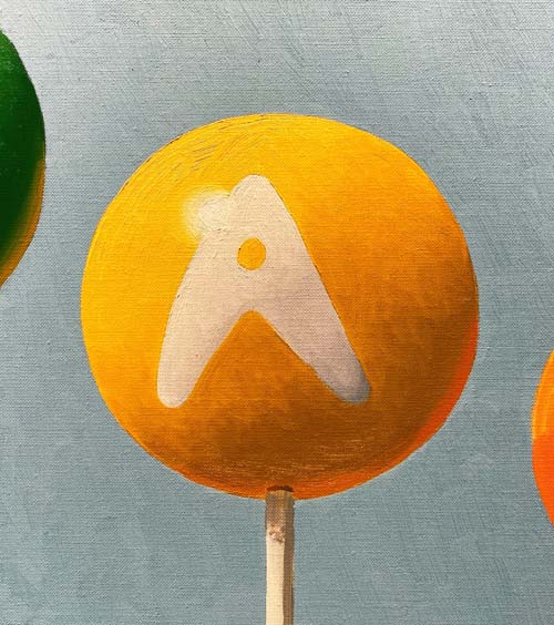
Notice the orange glow on the lower right hand side of this
yellow ball.
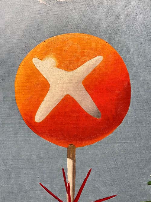
With the three 'LAX' balls rendered, I'll move down the canvas
and address the poles and the starbursts.
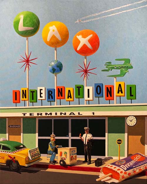
Here's a look at the entire canvas to this point.
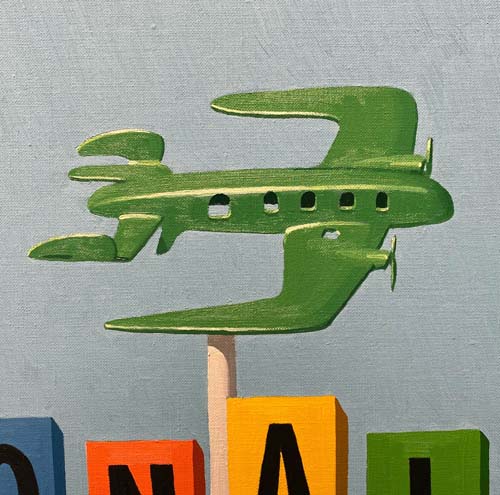
The only elements in the upper half of the painting that hadn't
been addressed were the airplane and the globe. I mixed up some
thalo green, cadmium yellow and just a hint of French
ultramarine blue and white.
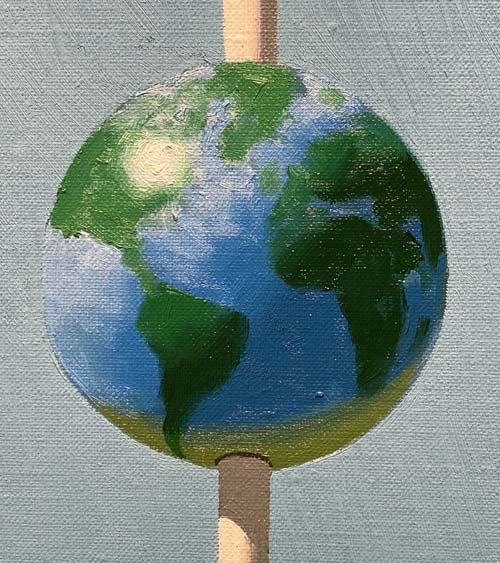
The globe used some of the same green mixture that I used on the
airplane and a thalo blue and white combination for the ocean.
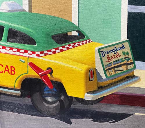
The taxi is finished. I increased the brilliance of the yellow
hue after looking carefully at the overall values of every part
of the painting.
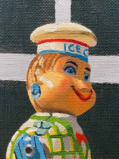
Time to move on to the ice cream vendor. I've finished his head
and will move down his body, mixing the myriad of colors and
grays for all the areas.
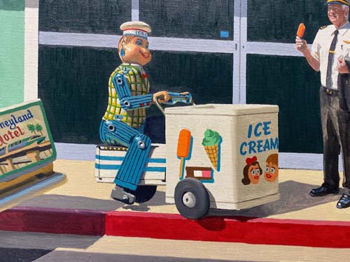
After a few days, the ice cream vendor is finished. I like the
way the rivets and tabs tell that it is made of tin.
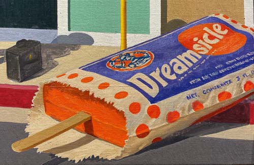
The Dreamsicle, with its little wrinkles in the wrapper, painted
with grays made with French ultramarine blue, burnt sienna,
white and yellow is done.
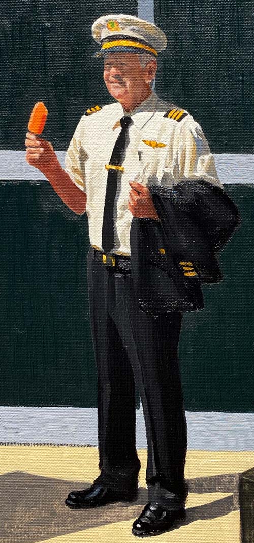
Figures are always difficult, and when it is a friend that is
posing as the main character, it is even more difficult. I
always want the likeness to be pretty close, where I don't worry
about the likeness when I photograph someone passing by in the
public domain. Phil turned out great, in my opinion, and really
looks the part!
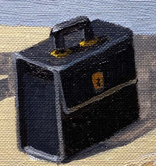
The pilot's briefcase is painted with five values of black. My
mixture for black is burnt umber, French ultramarine blue and
black. I add a little white to get the lighter shades and mostly
white to get the highlights.
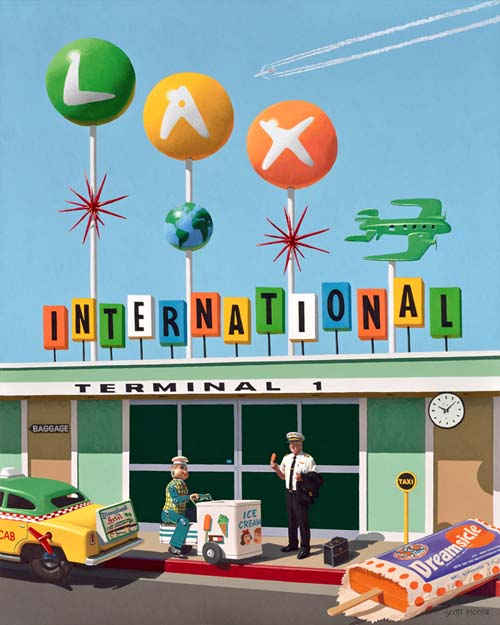
I painted a final 'heavy' layer on the sidewalk and a couple
other areas and "LAX...LOL" is finished! Cool vibe don't you
think?
|