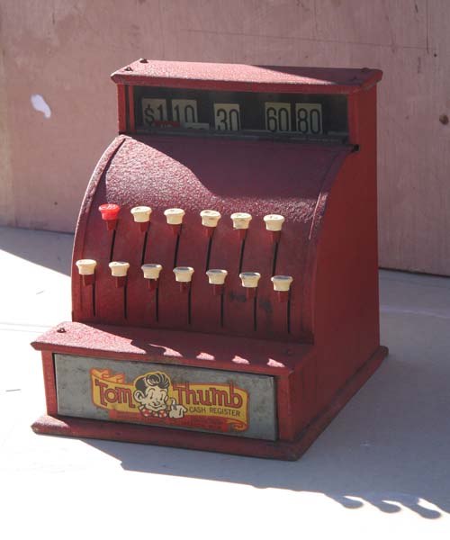
This toy cash register
caught my eye when searching for a 'starting object' for my next
painting. I set it out in the sun and looked at the
patterns that the shadows cast. I also imagined that it
was a real cash register and thought of how it played a part in
our lives.
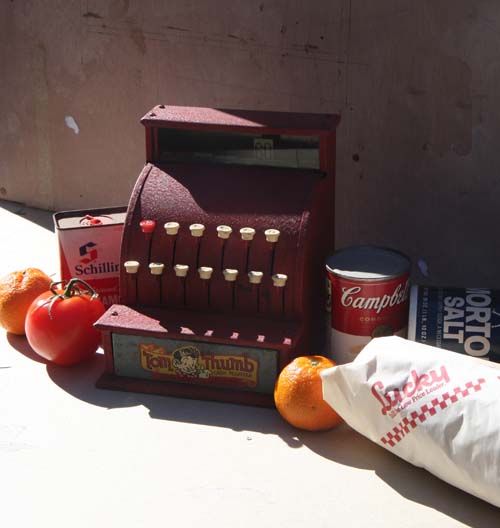
I gathered up some food products that you would purchase from a
grocery store and huddled them around the register. I
envisioned a woman on top of the register, grocery bags in hand,
waiting for the bus.
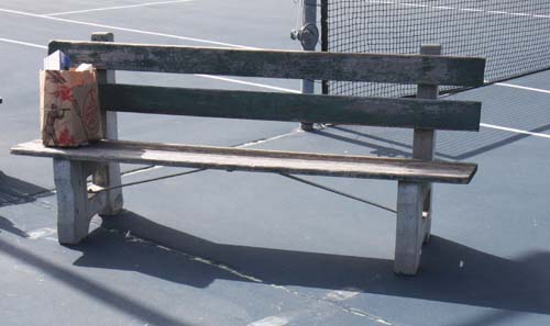
I needed a bench for the bus stop.
Laguna Beach has maintained this old style bench around the
city. It is in the parks, on the streets and this one was
on the Laguna Beach High School tennis courts. I set a bag
of groceries on the bench to get some scale and to see how the
shadows looked.
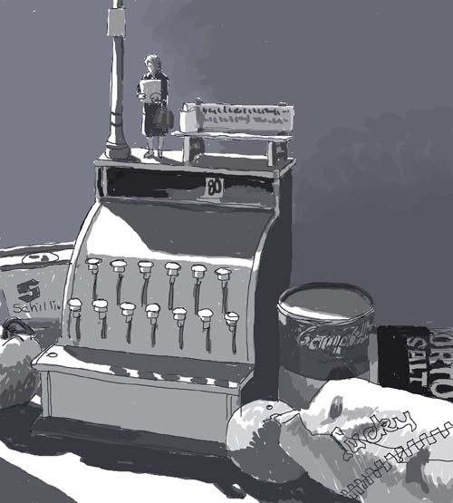
I sketched this scene with all the components. Now, all I
needed was someone to play the part of the grocery shopper...
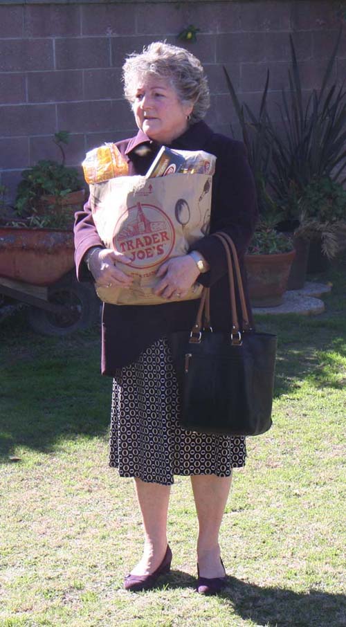
...Carol's sister Jan agreed to be my model and posed in her
backyard. Exactly what I was looking for. And with
Jan in place, the title of the painting was simple. It
will be called "Grocery Shopper".
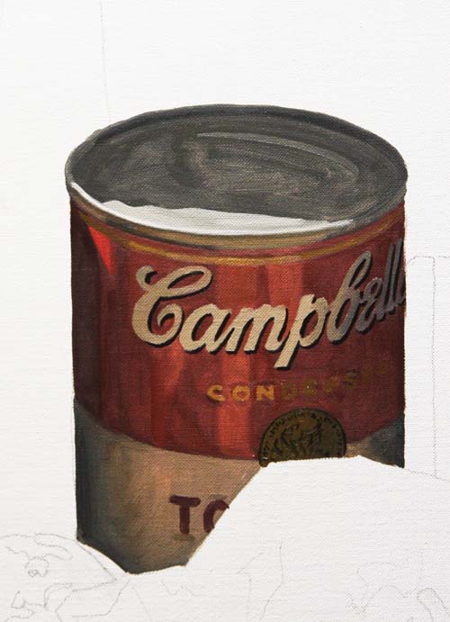
With all the components sketched in on the canvas, I've begun by
painting the soup can. As usual, the first pass of oil
pigment is thinned down with turpentine.
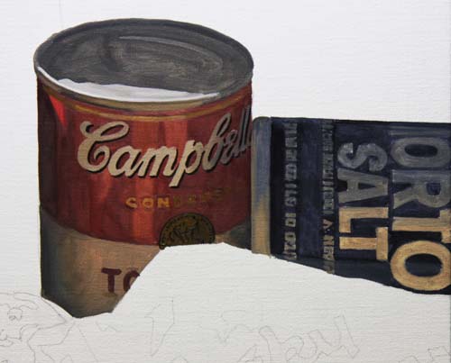
Next was the Morton Salt container. Notice how the
lettering goes from a cool gray to a lighter warm gray as it
moves towards the front. It is getting reflective light
from a white paper meat wrapper.
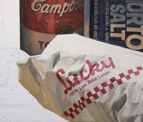
This old meat wrapper from a Lucky's store was on my shelf in my
studio, left over from an old project. It's perfect for
the painting. Look at all the variances of grays in the
shadows. The warmer and lighter ones are reflecting the
warmth from the table.
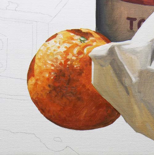
When an object is painted without all the values surrounding it,
it may appear to be a little out of place. This orange
will settle into the painting once the cash register and the
cast shadows are painted.
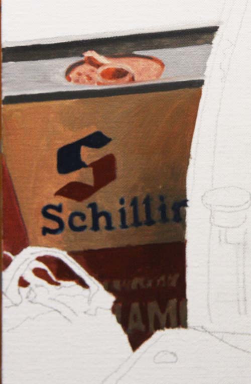
This Schilling cinnamon spice can is a generic symbol of the
times. One of those very recognizable icons that has stood
the test of time.
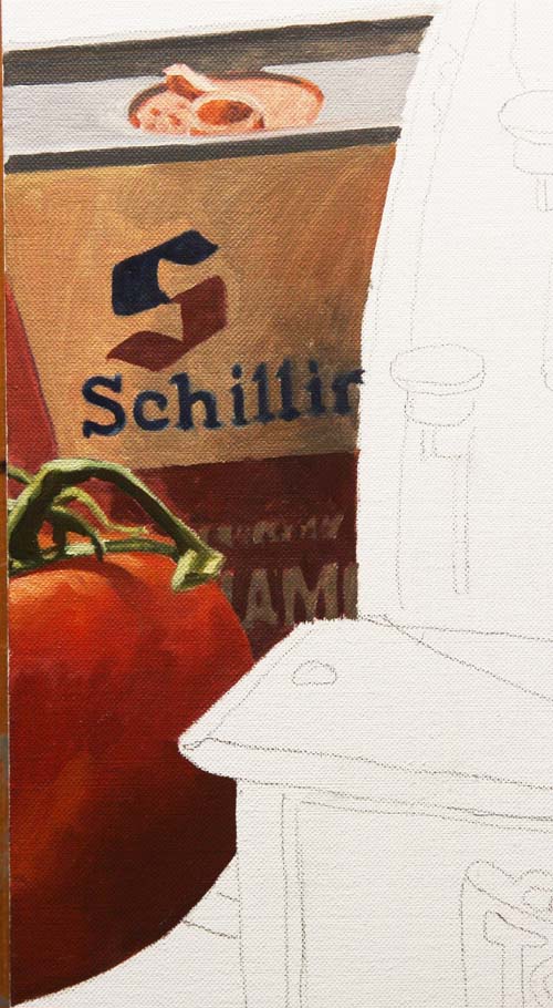
With the tomato rendered below the spice can, I'm ready to deal
with the counter top's color and shadows.
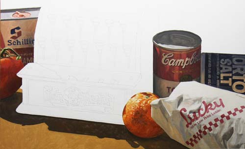
I've surrounded the cash register, making it look like a ghost
on the canvas. I'll attack the register next.
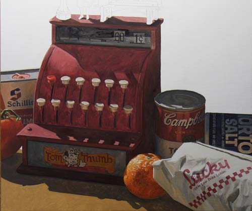
The main object, the cash register, has its first coat of paint.
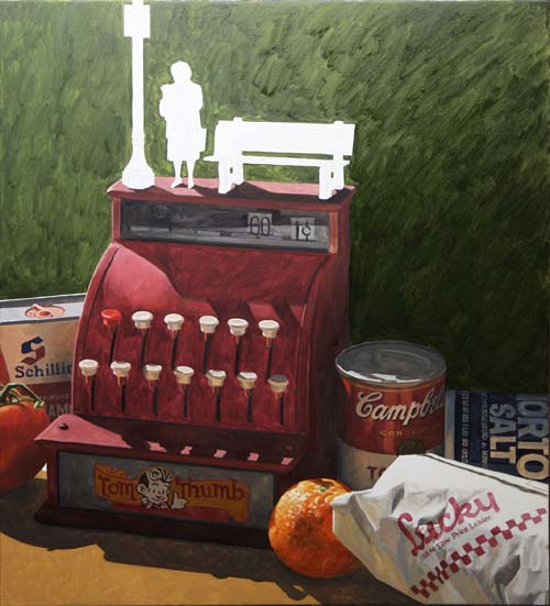
The back wall is given a greenish hue, going from light to dark
as it moves away from the light source.
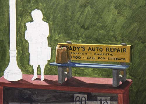
I decided to use our son, Brady's name for the bench
advertising. It would be more appropriate to say Brady's
Mercedes Dealership, but Auto Repair fit better :-)
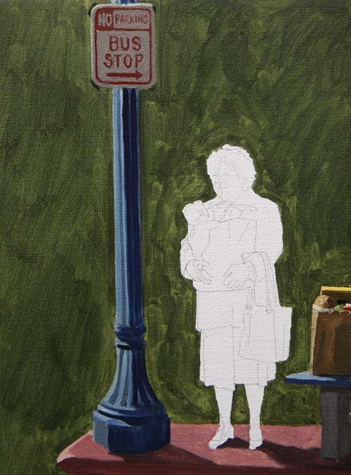
This is a close-up of the lamp post.
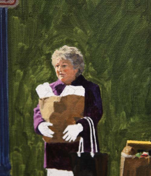
I've begun to paint Jan, the last object to be painted before
beginning the final passage of paint.
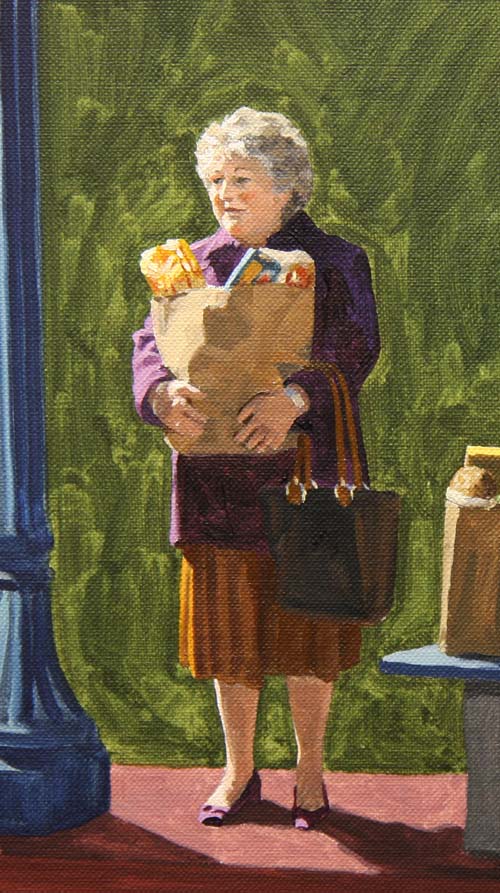
My grocery shopper is now at the same 'half finished' point as
the rest of the painting and...
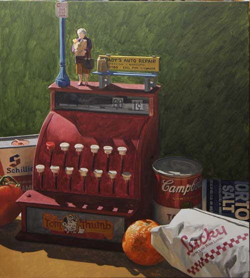
...the painting is halfway done, with every inch of the canvas
receiving a thin layer of oil paint.
The first area to be painted with the final layer of paint is
the back wall. Its hue and value will help dictate the
color and darkness of all the other areas. There is a
subtle transition of light to dark from left to right.
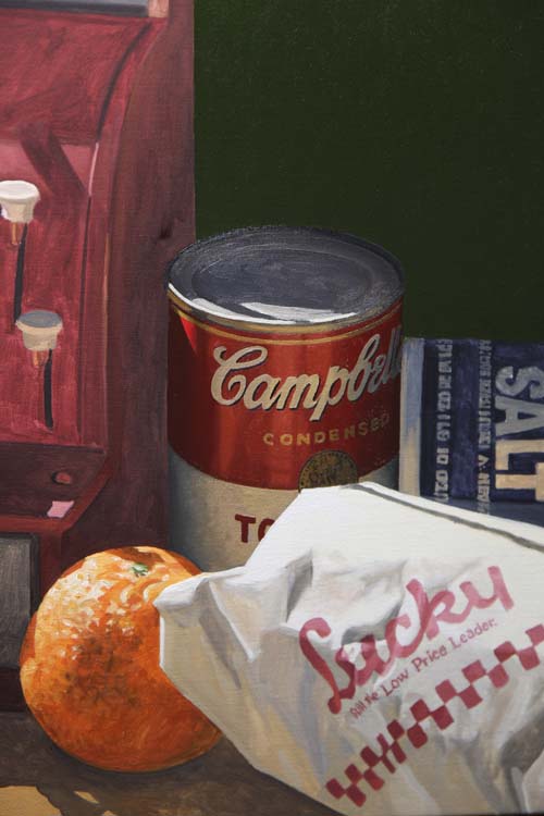
The Campbell's soup can is done. I painted it first
amongst the grouping of items on the right because it will be
easier to overlap the forward objects.
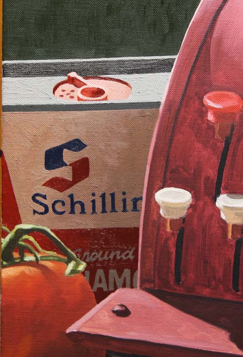
The Schilling cinammon can is finished. Notice how it
transitions from light to dark (left to right), as the
reflective light is brighter on the left.
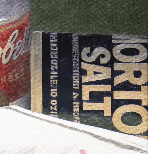
The final paint has been applied to the Morton Salt
container with both bristle and sable brushes, the latter for
the small tight areas. The meat package's white paper reflects
into the salt container, making the lower area lighter than the
top of the container, which faces the sky.
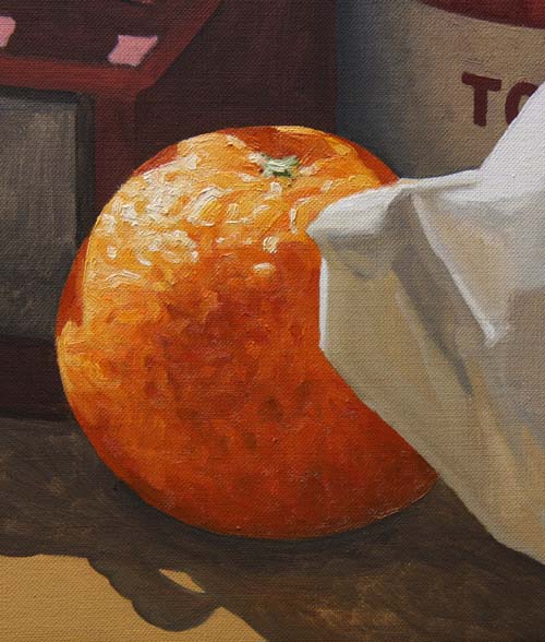
Look closely and you can see the thickness of the paint as it
gets into the highlight areas of the orange.
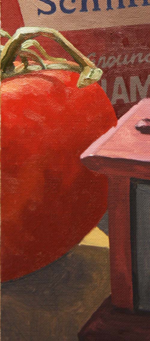
You can also see the thickness of the final layer of oil on the
highlight areas of the tomato and the tomato stem.
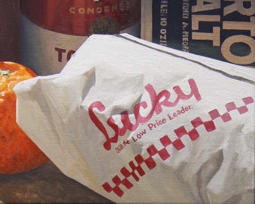
I enjoyed painting the butcher paper wrapping. There are a
variety of grays that show the reflective light and define the
shape of the package.
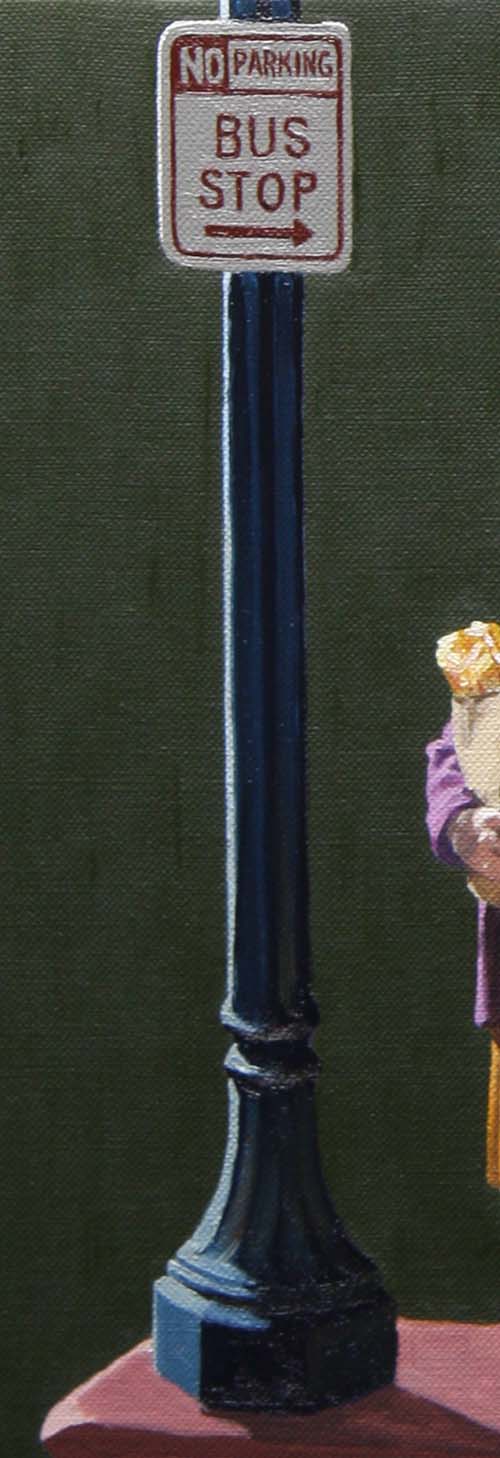
The lamp post is a simple shape in the painting, but a very
important part of the design. It helps frame the focal
point of the painting.
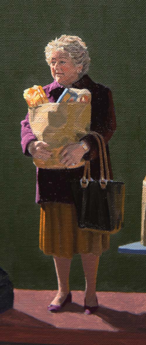
With my apologies to my sister-in-law (who is a lot prettier and
thinner) I have completed the shopper. I chose to change
her to fit the mood of the painting rather than try to do a
portrait.
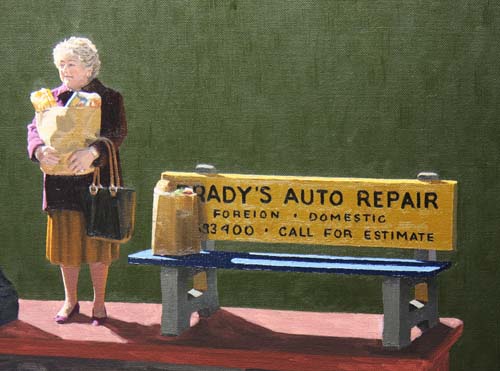
All the objects on top of the cash register are completed.
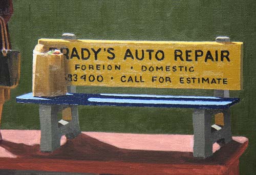
Here's a closer look at the bus stop bench.
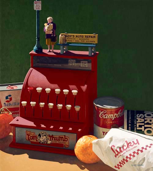
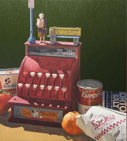
Here's the painting completed.
|